Emily Pearson is a visual communicator with a strong focus on brand identity and design for digital & print.

Wisp Video Game Concept

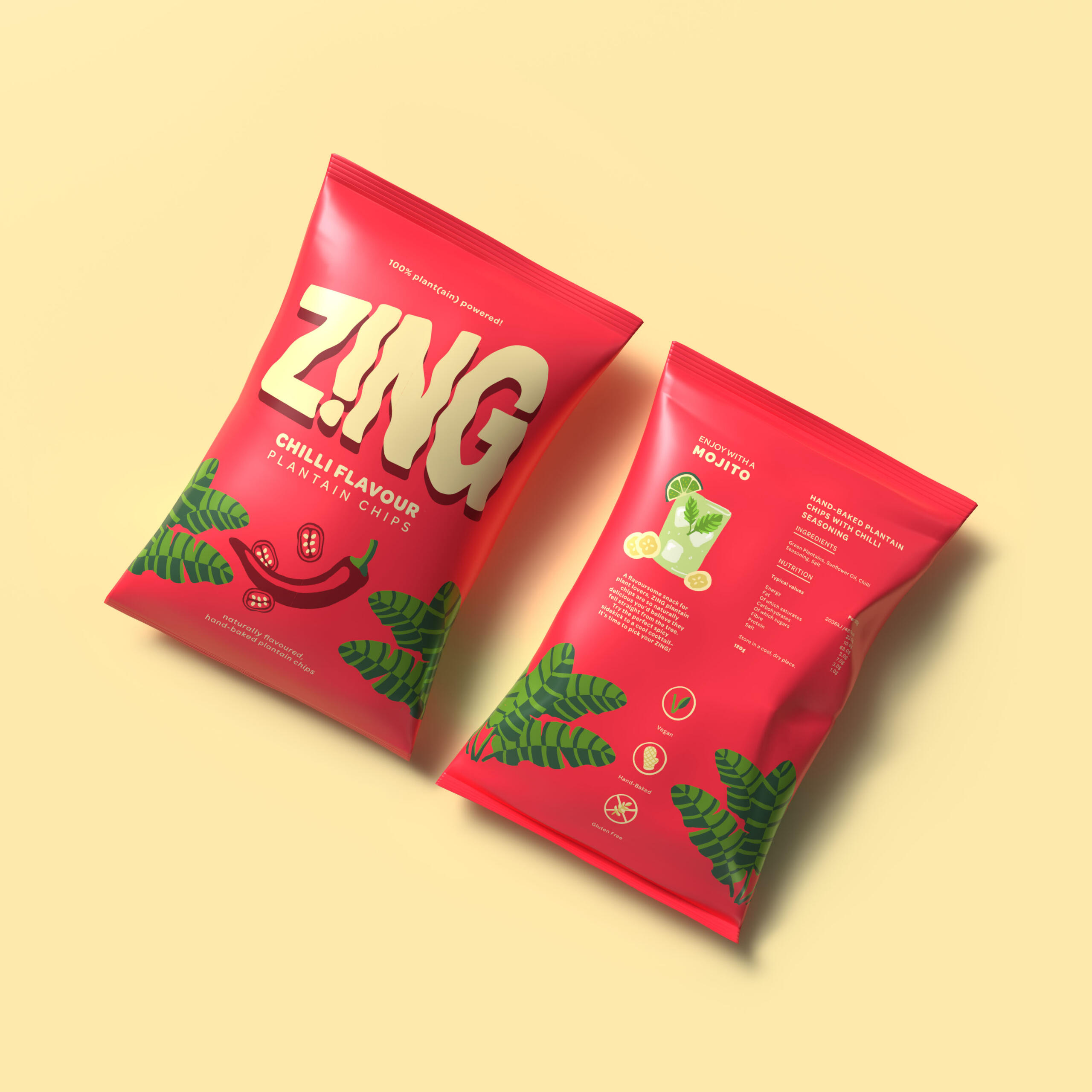
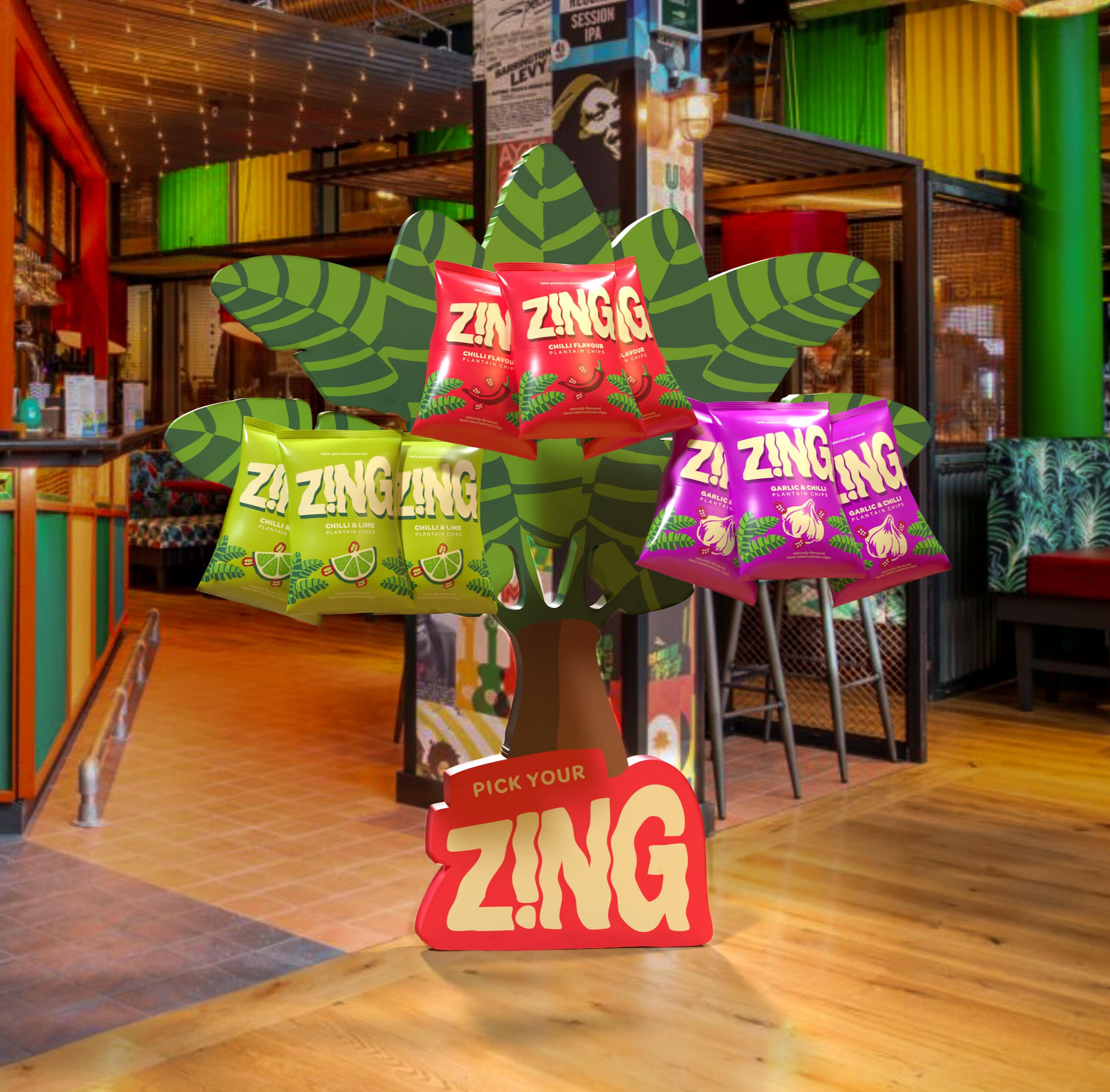
Zing Conceptual Bar Snack

A Penny for Your Thoughts

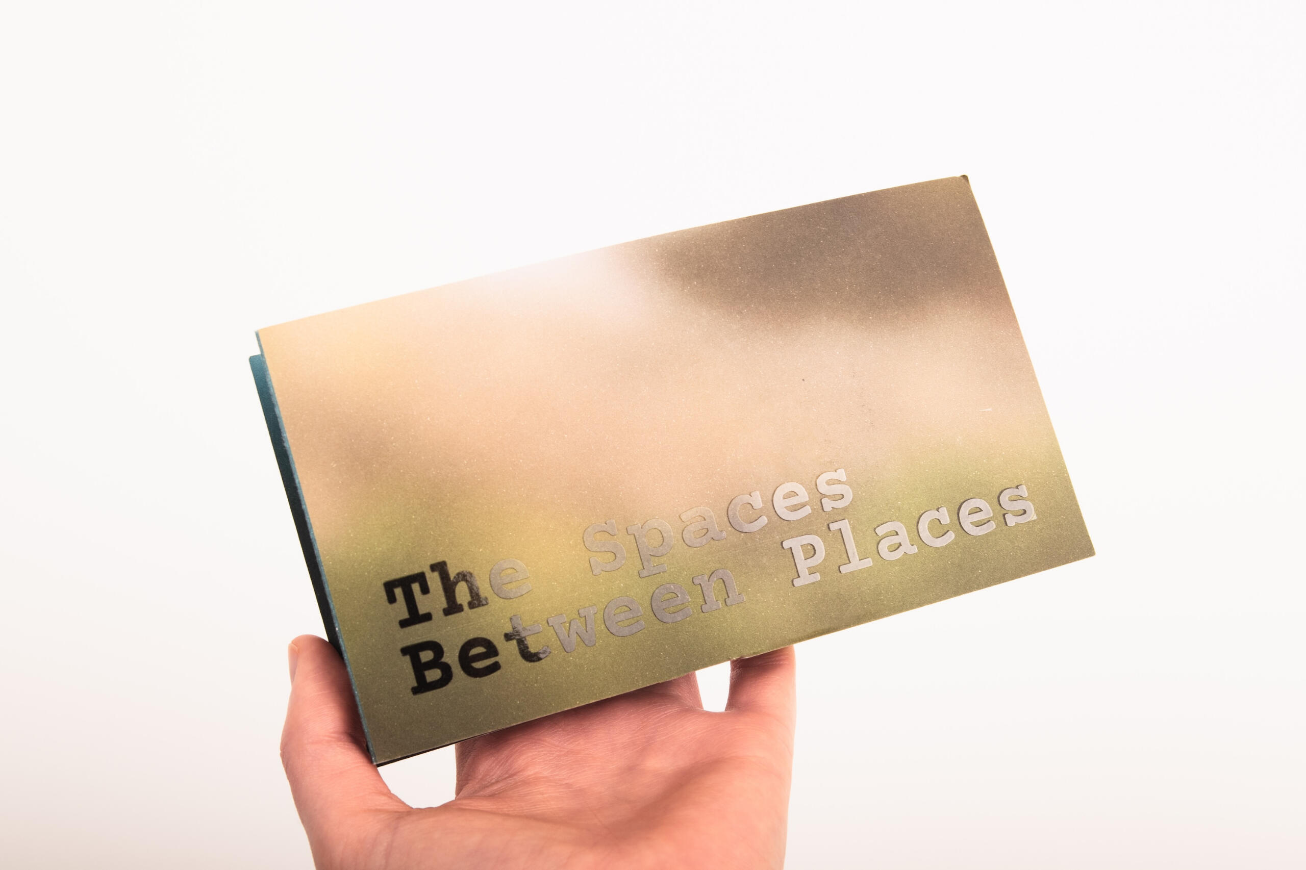
The Spaces Between Places

Book Cover Design

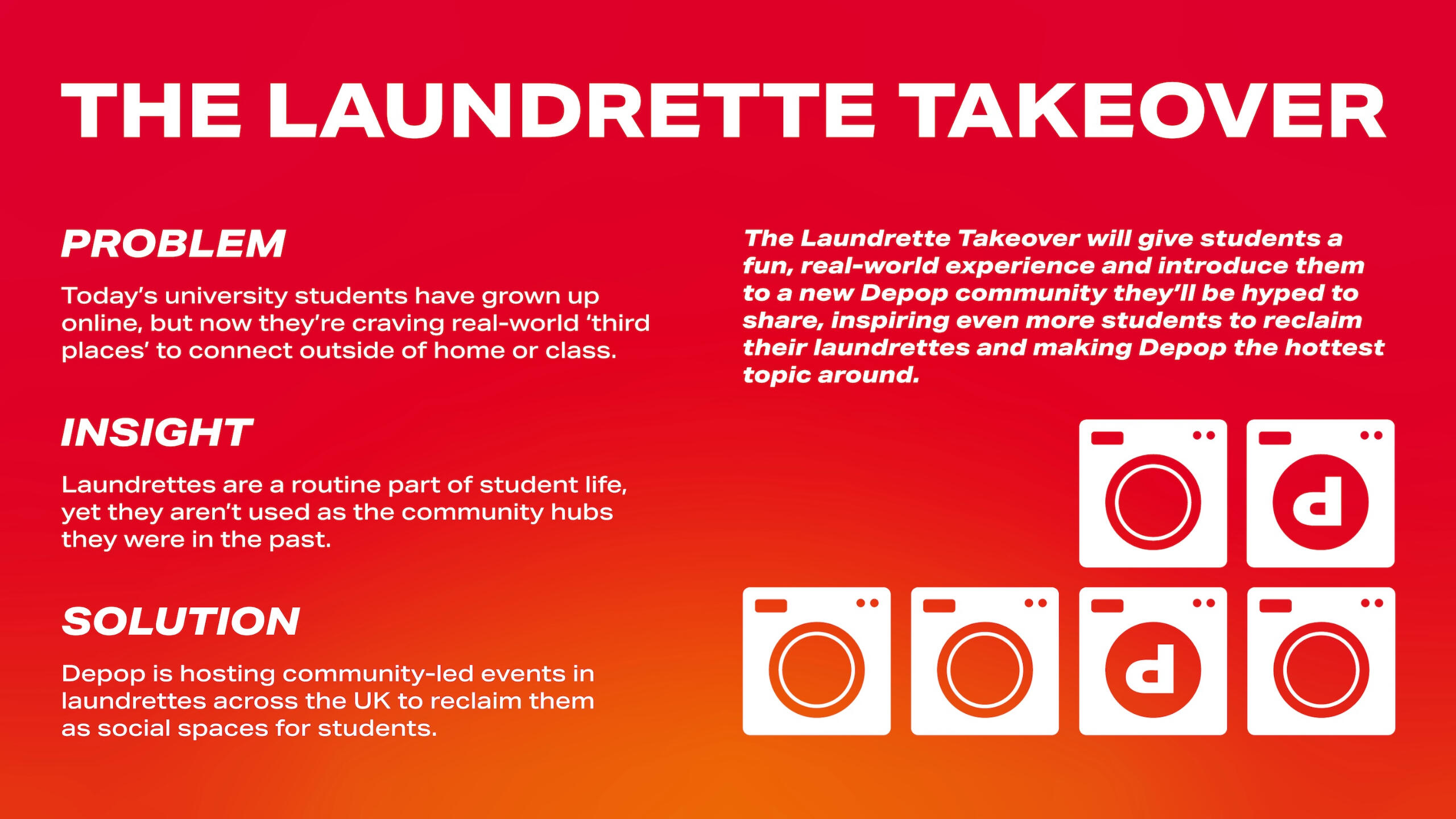
The Laundrette Takeover

Graduation Show Motion Design
Emily Pearson is a visual communicator with a strong focus on brand identity and design for digital & print.
Hi there! I'm a recent Visual Communication graduate from Arts University Bournemouth working in digital, print and motion. I love to create designs with the power to make people care about a brand, issue or cause. I approach each project uniquely, willing to try my hand at anything, leading me to develop a multidisciplinary skillset. I'm currently seeking opportunities in design where I can make a difference, so if you would like to work together, please get in touch!
Qualifications & Awards
| Title | Institution | Level | Year |
|---|---|---|---|
| BA Hons Visual Communication | Arts University Bournemouth | First Class Honours | 2025 |
| JDO RAW | JDO Global | Shortlisted | 2025 |
| A Level Graphic Design | Rainham Sixth | A | 2022 |
| A Level Fine Art | Rainham Sixth | A* | 2022 |
| A Level Photography | Rainham Sixth | A | 2022 |
Contact Me!
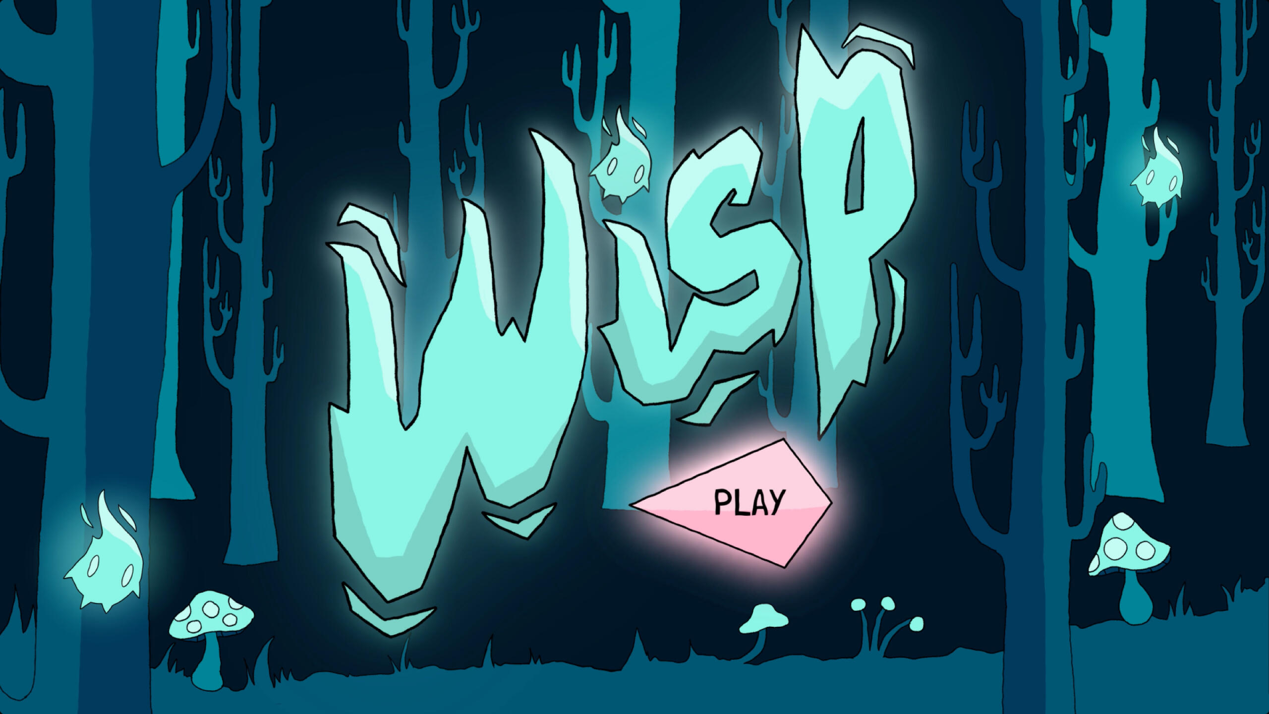
‘Wisp’ is an RPG game that explores queer issues and the fear of the other through the lens of the witch.
Play as Rowan, a young queer person as you follow her journey home to self-acceptance and resilience. You will encounter many monsters along the way that will try to slow you down, but not without the help of your guide, Cat-Sith, a witch-cat hybrid inspired by Scottish mythology.


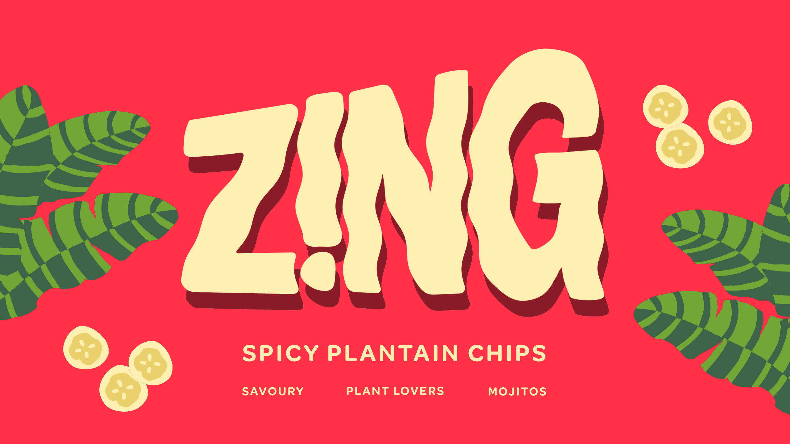
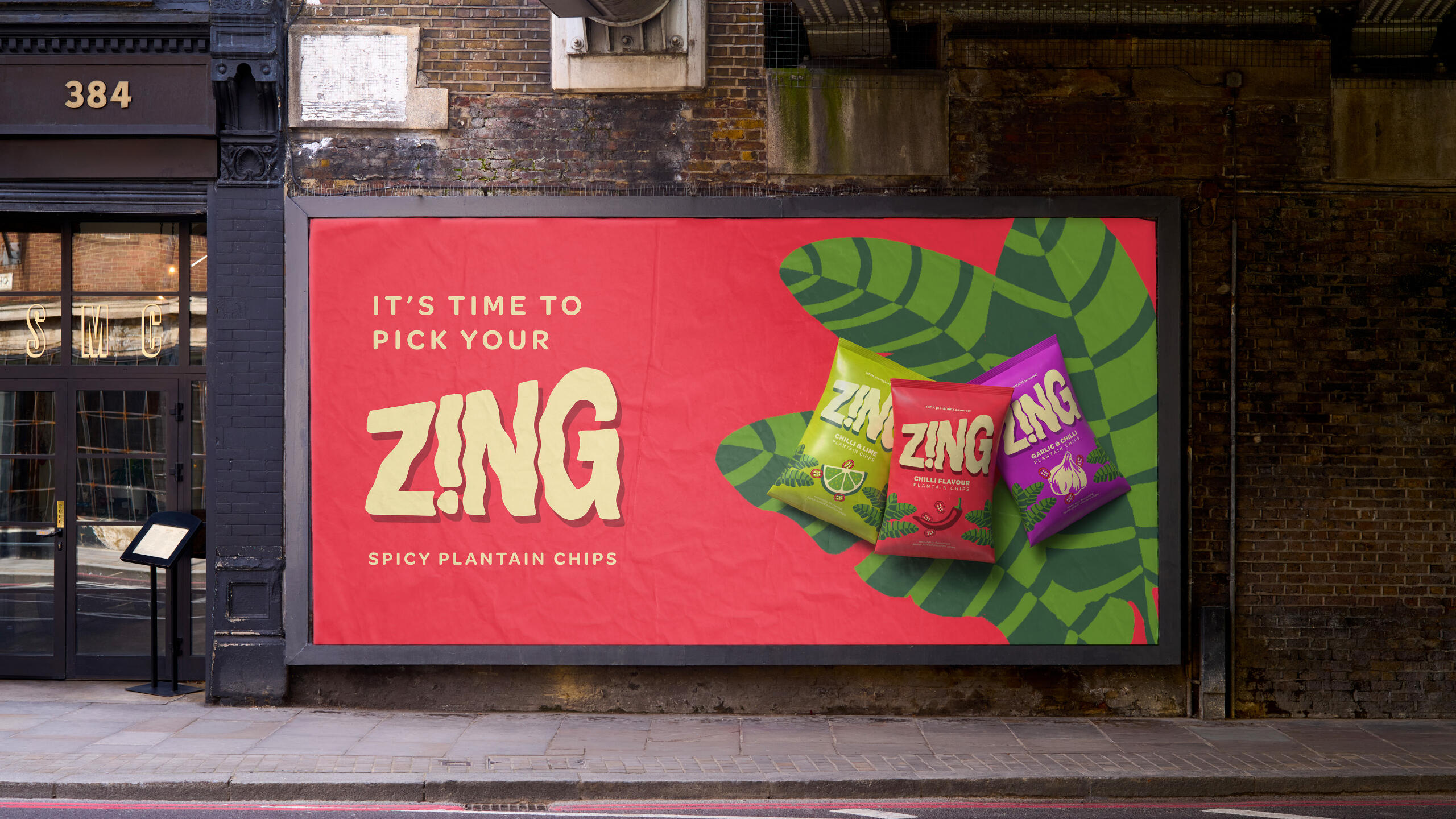
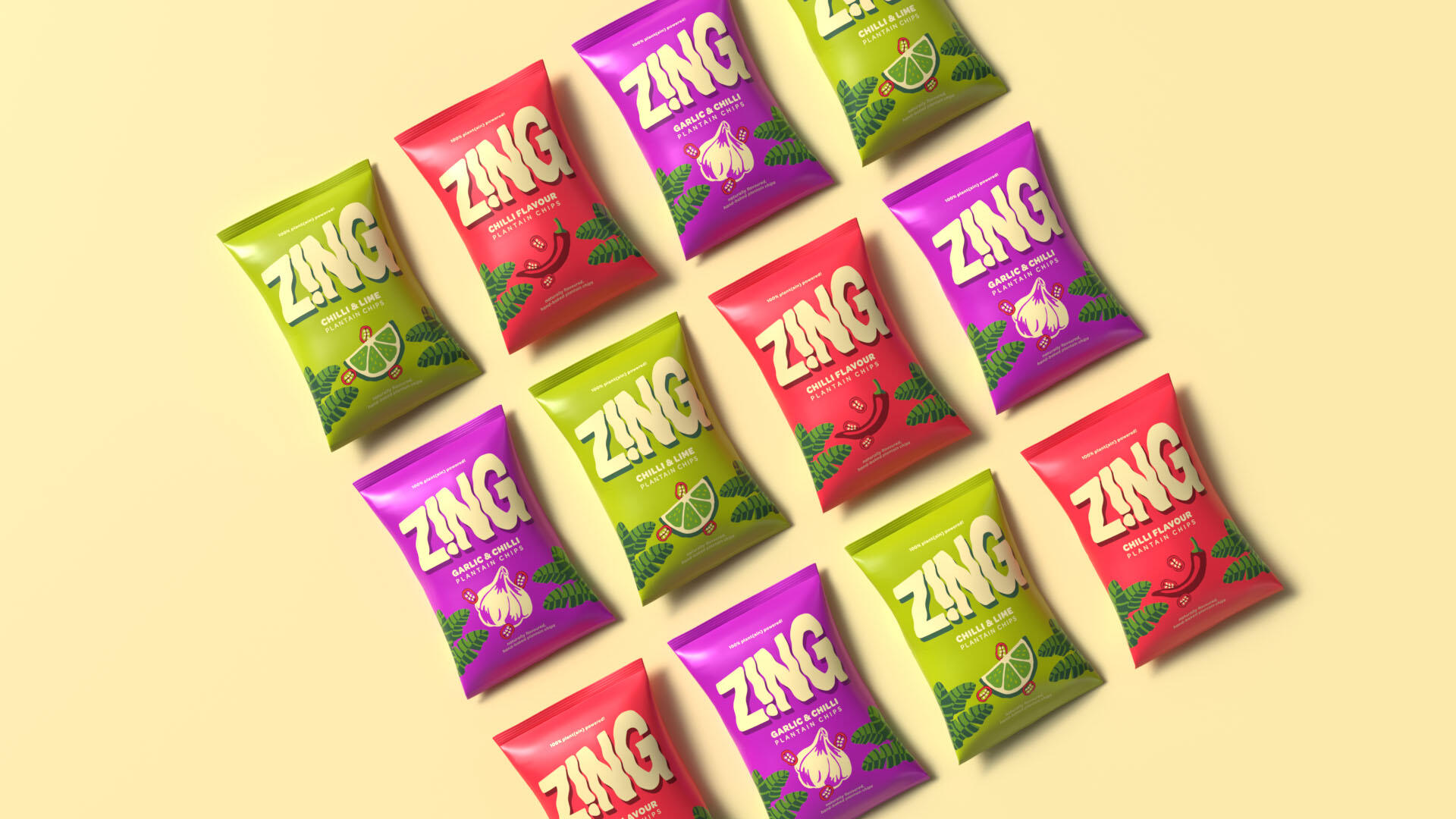
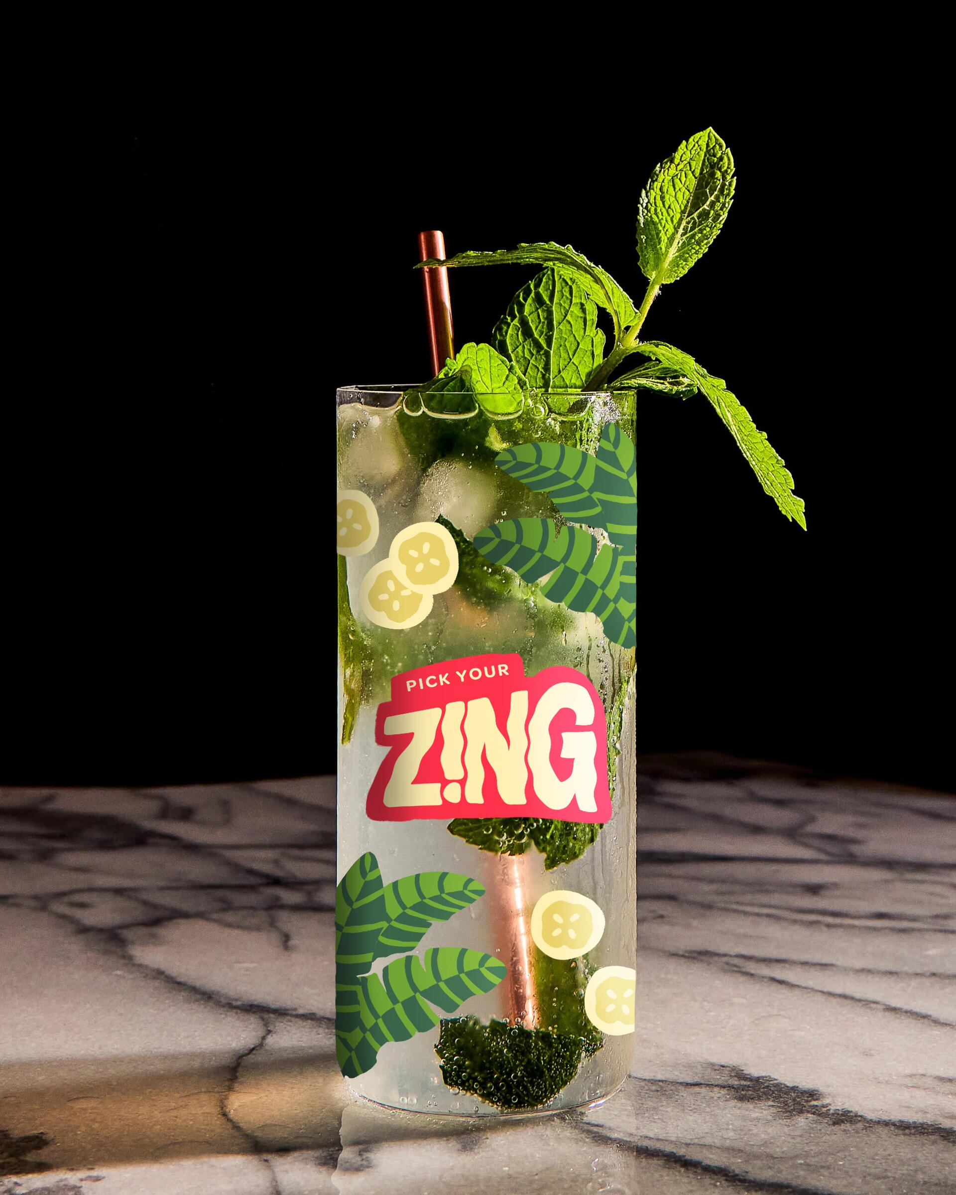
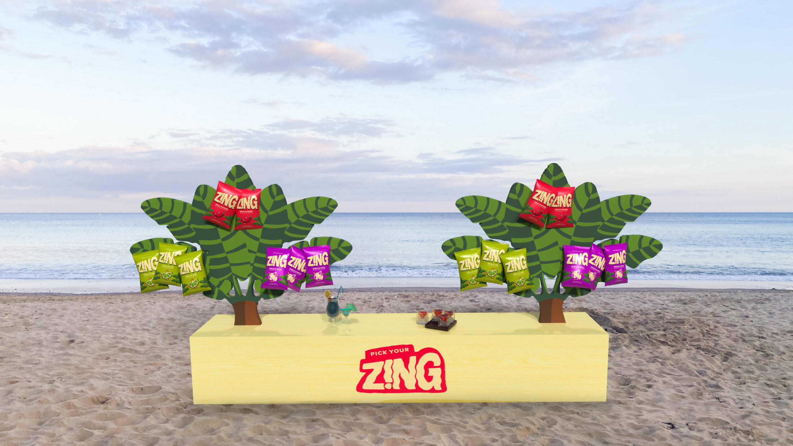
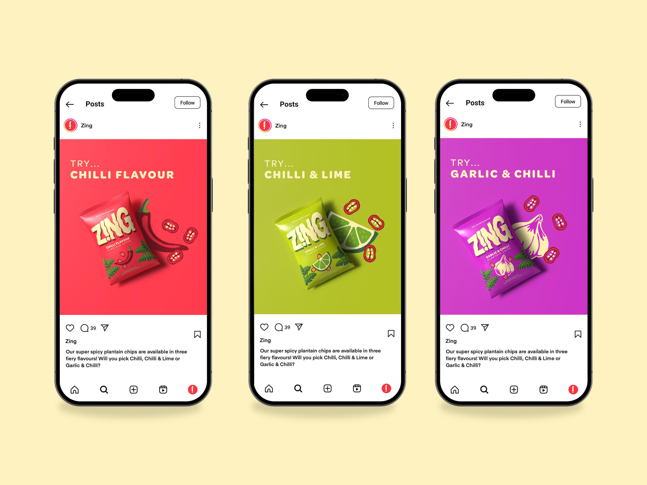
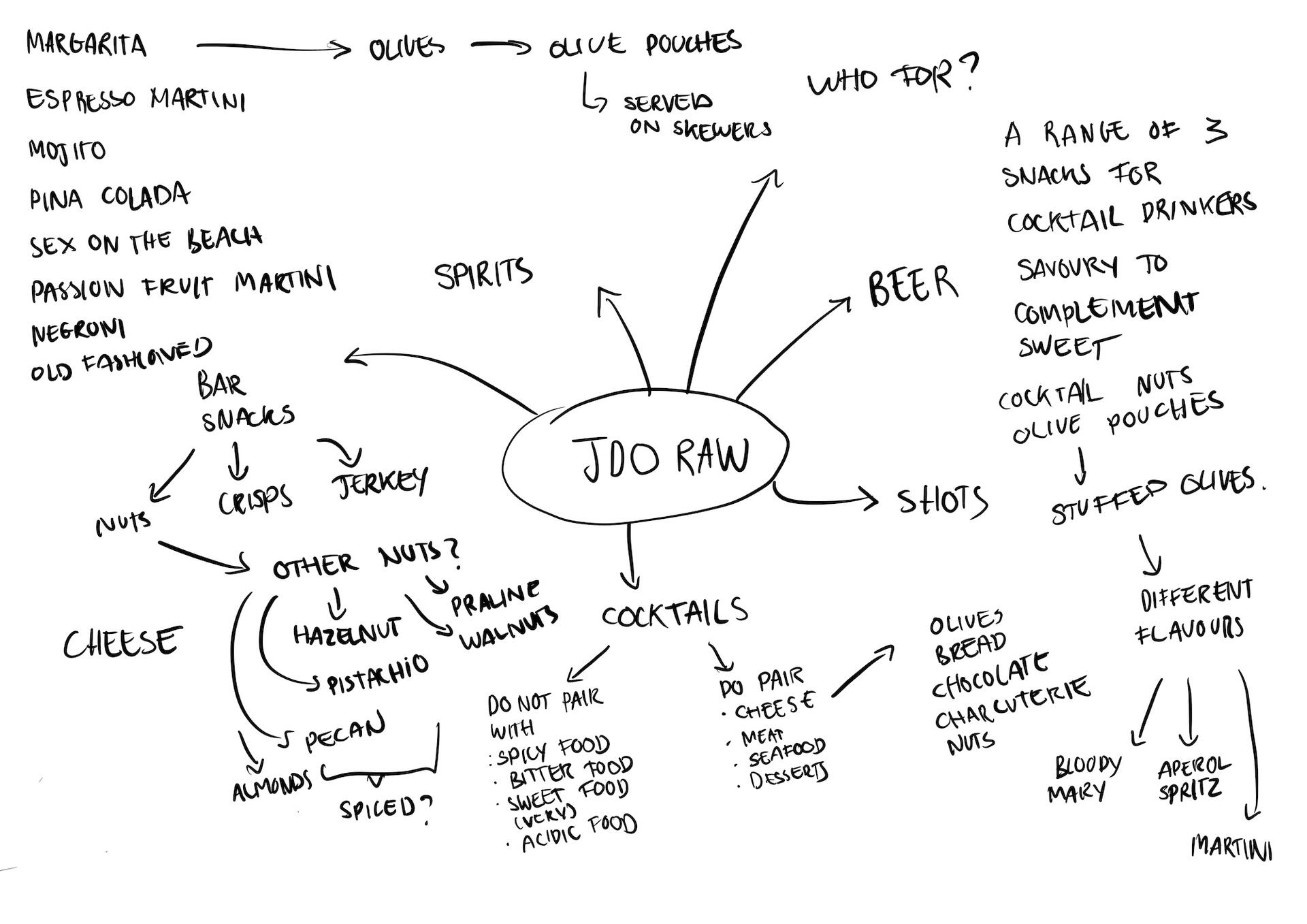
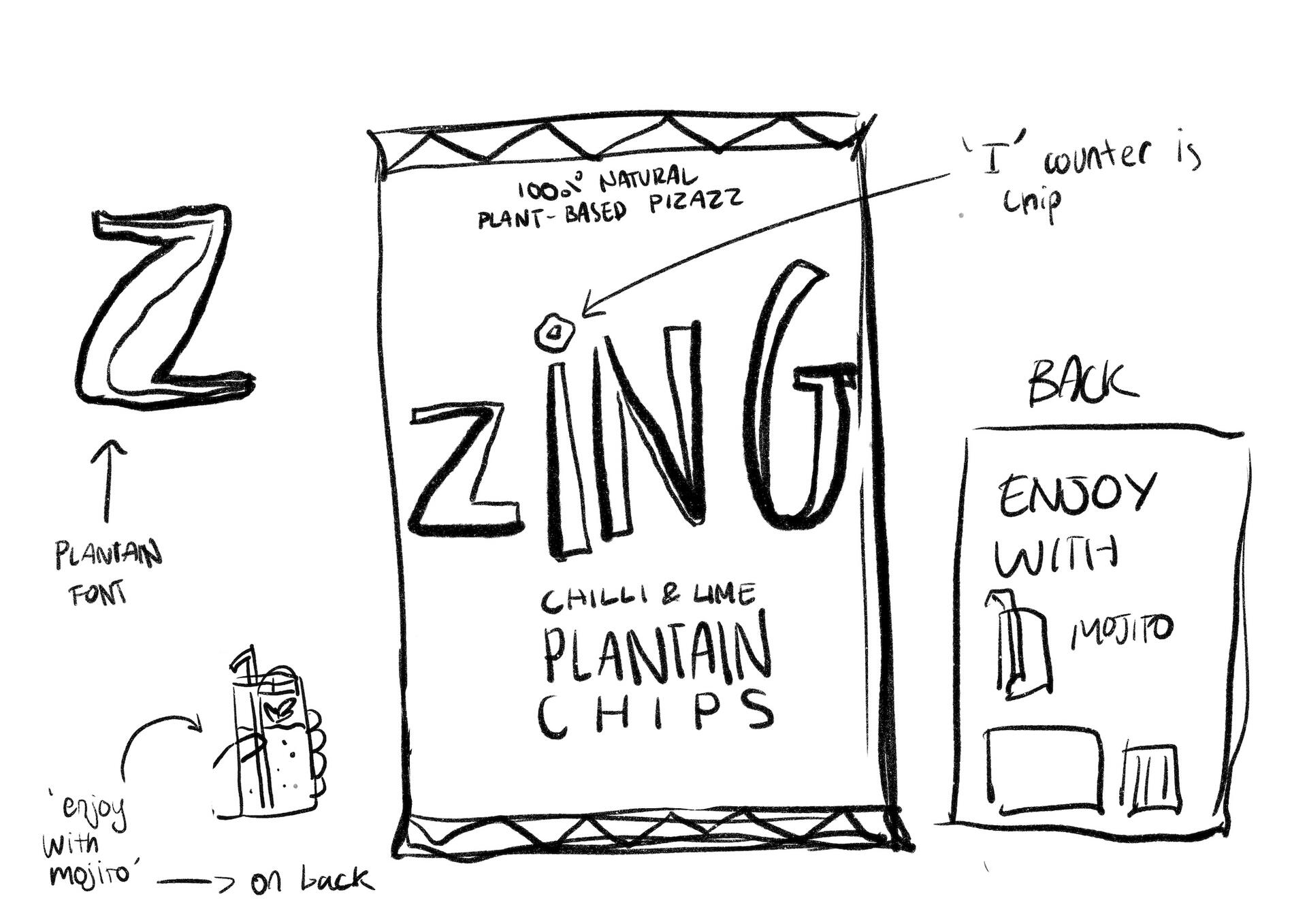
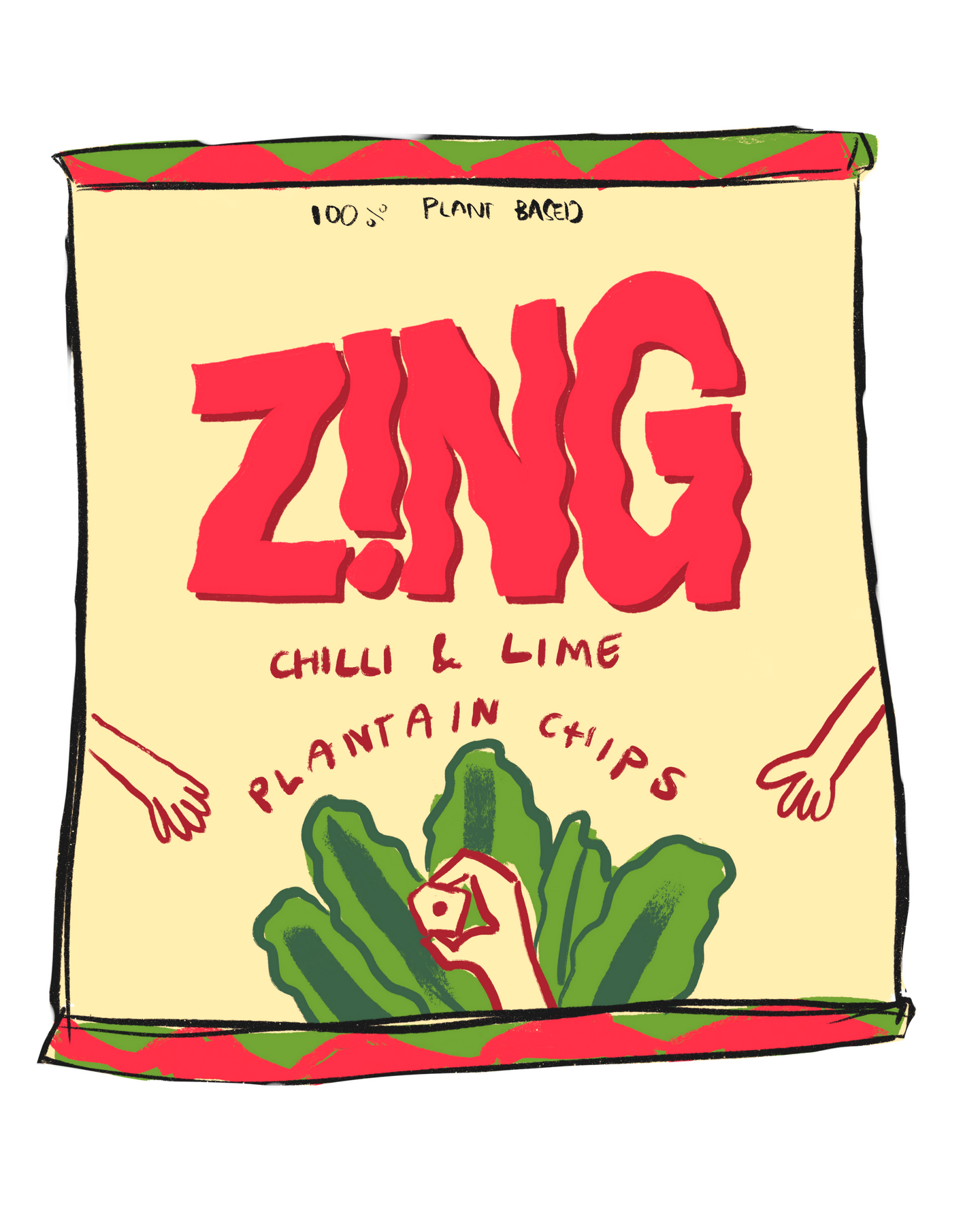
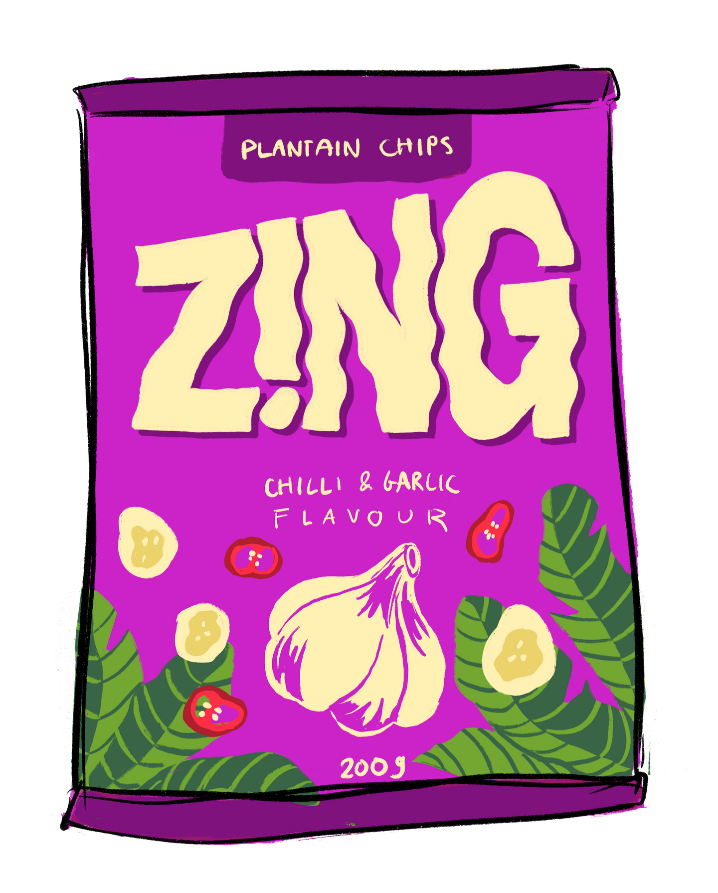
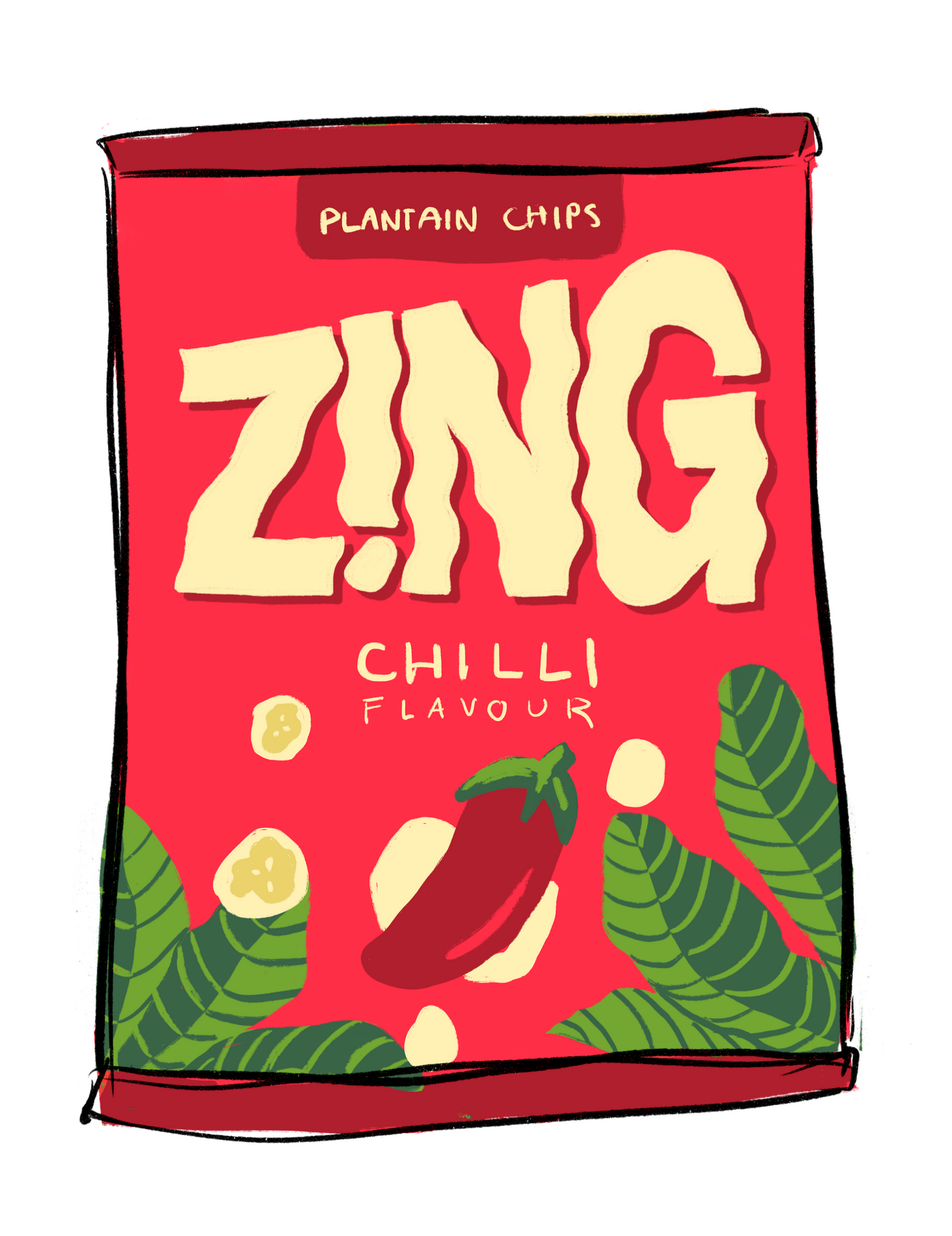
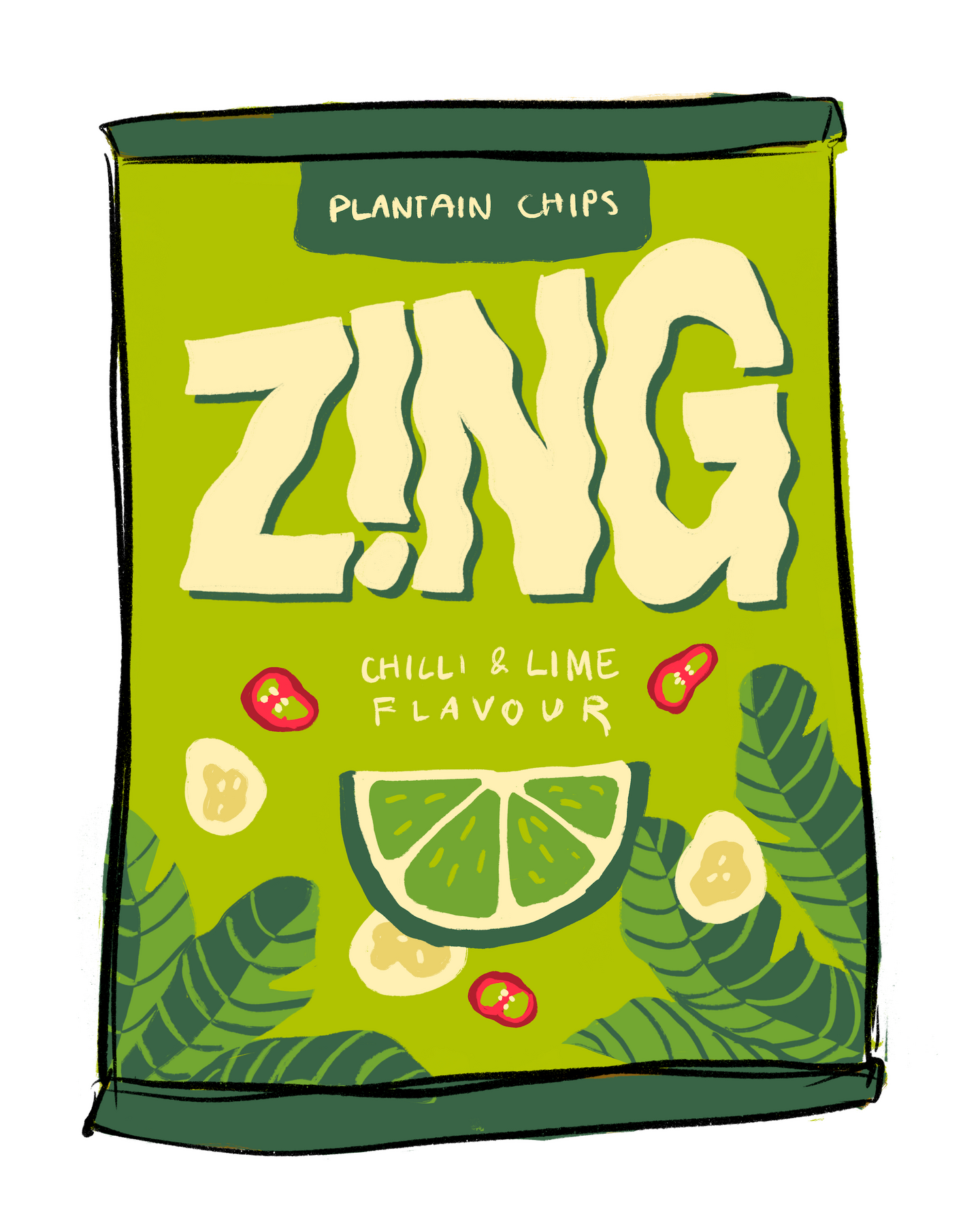
'Zing' is a conceptual bar snack brand that was short-listed for the 2025 JDO RAW competition brief.
The brief was to elevate the category from basic to bougie as alcohol brands have become fancier over time, unlike the snacks. 'Zing' is a snack for plant lovers that pairs well with a mojito. I created a pitch desk and 3D render video for submission.
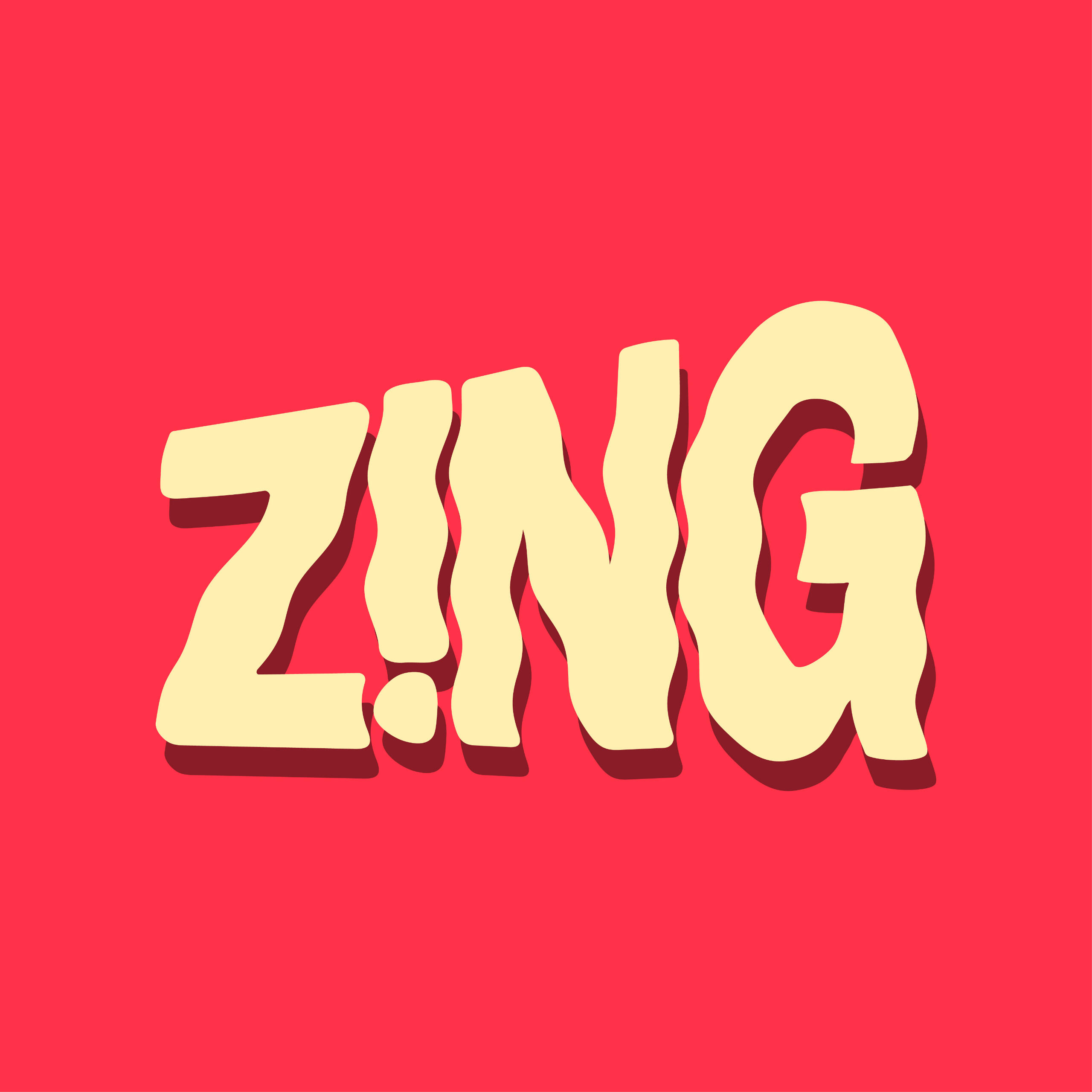
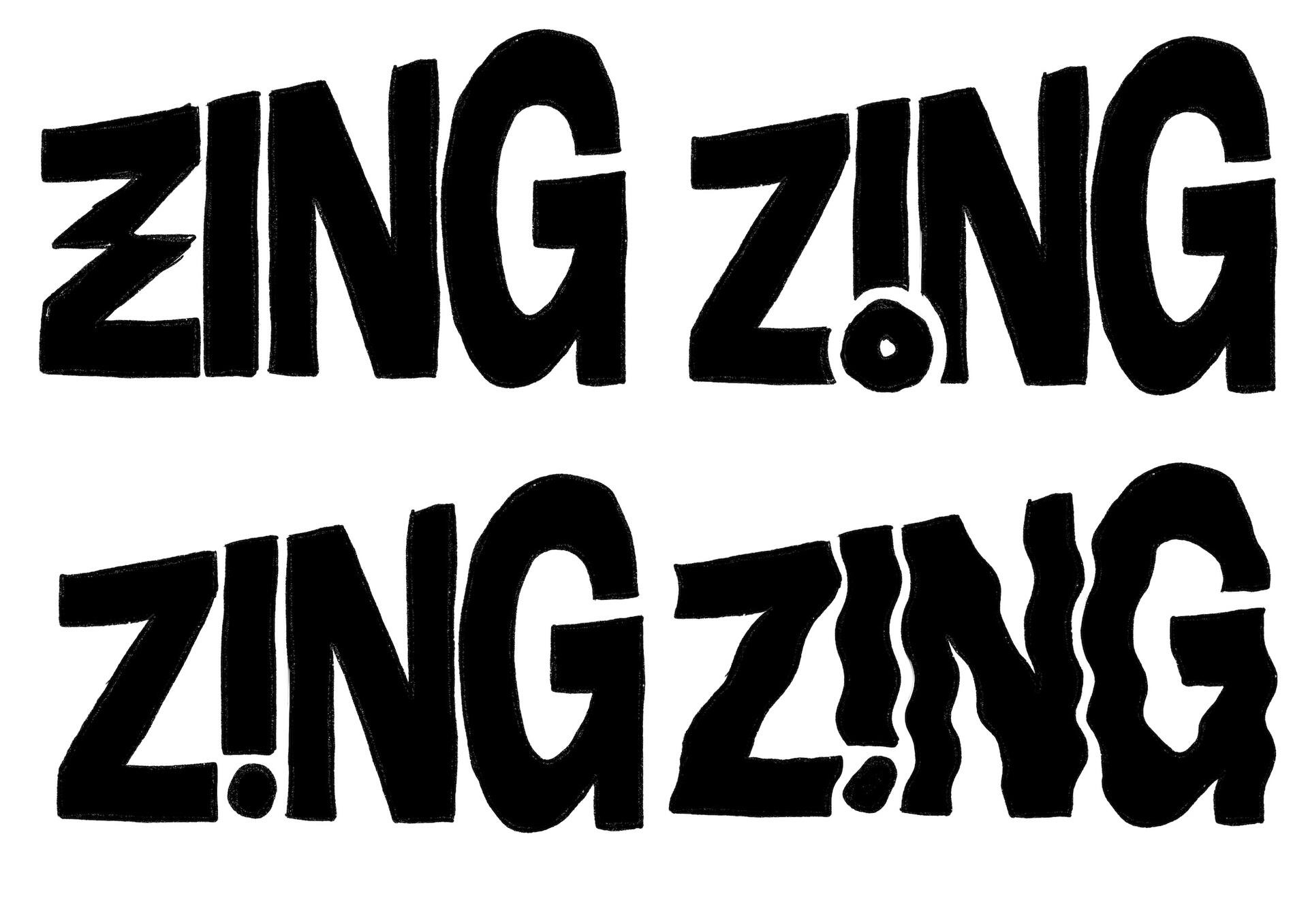
Logo
The logo design demonstrates the brand’s bold energy and party attitude. The ripples in the letter forms and the exclamation point are visual cues referencing the impactful flavour of the spicy snacks. The dot of the exclamation point subtly reflects the shape of the plantain chips.
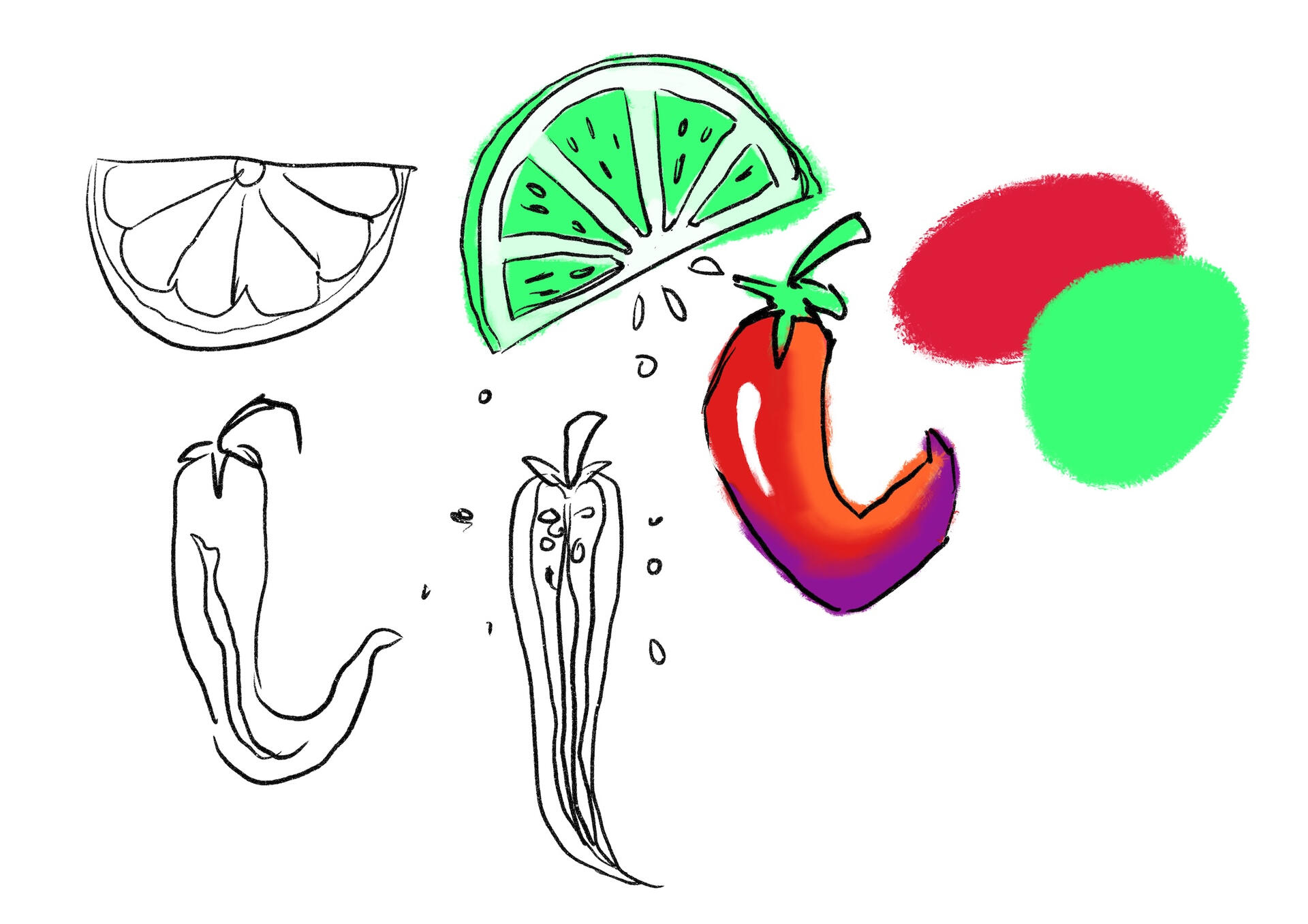
Colour Palette
The colour palette is vibrant and attractive, taking inspiration from colourful Cuban culture, where plantains are a staple food and the mojito cocktail originates from. It aims to evoke excitement around the plant-based snack in contrast to the more dated and muted appearance of traditional bar snacks.

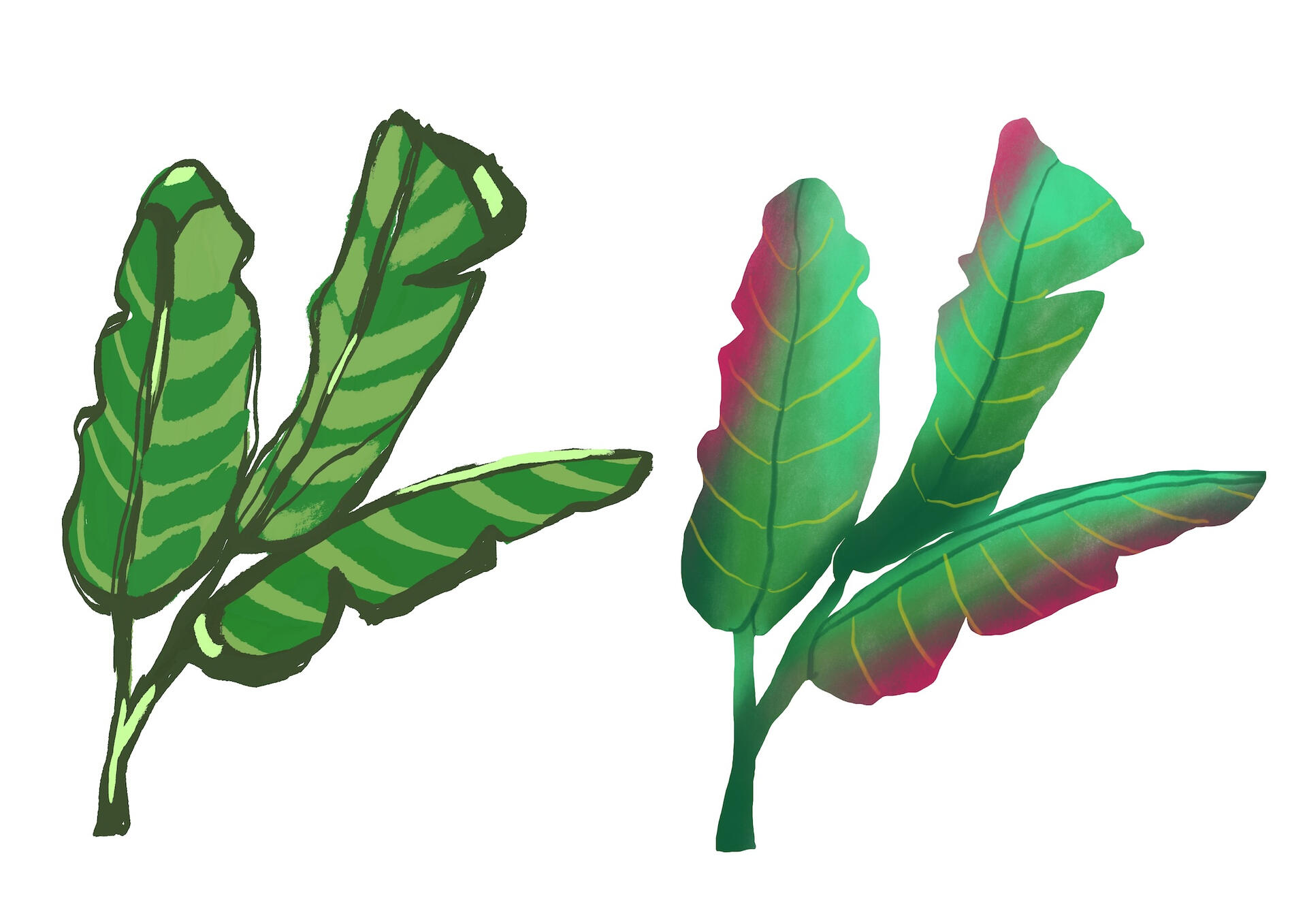
Illustrations
The illustrations create a unique and recognisable brand identity, especially the plantain leaves. They highlight Zing’s natural quality ingredients in a way that brings personality amongst the competitors.

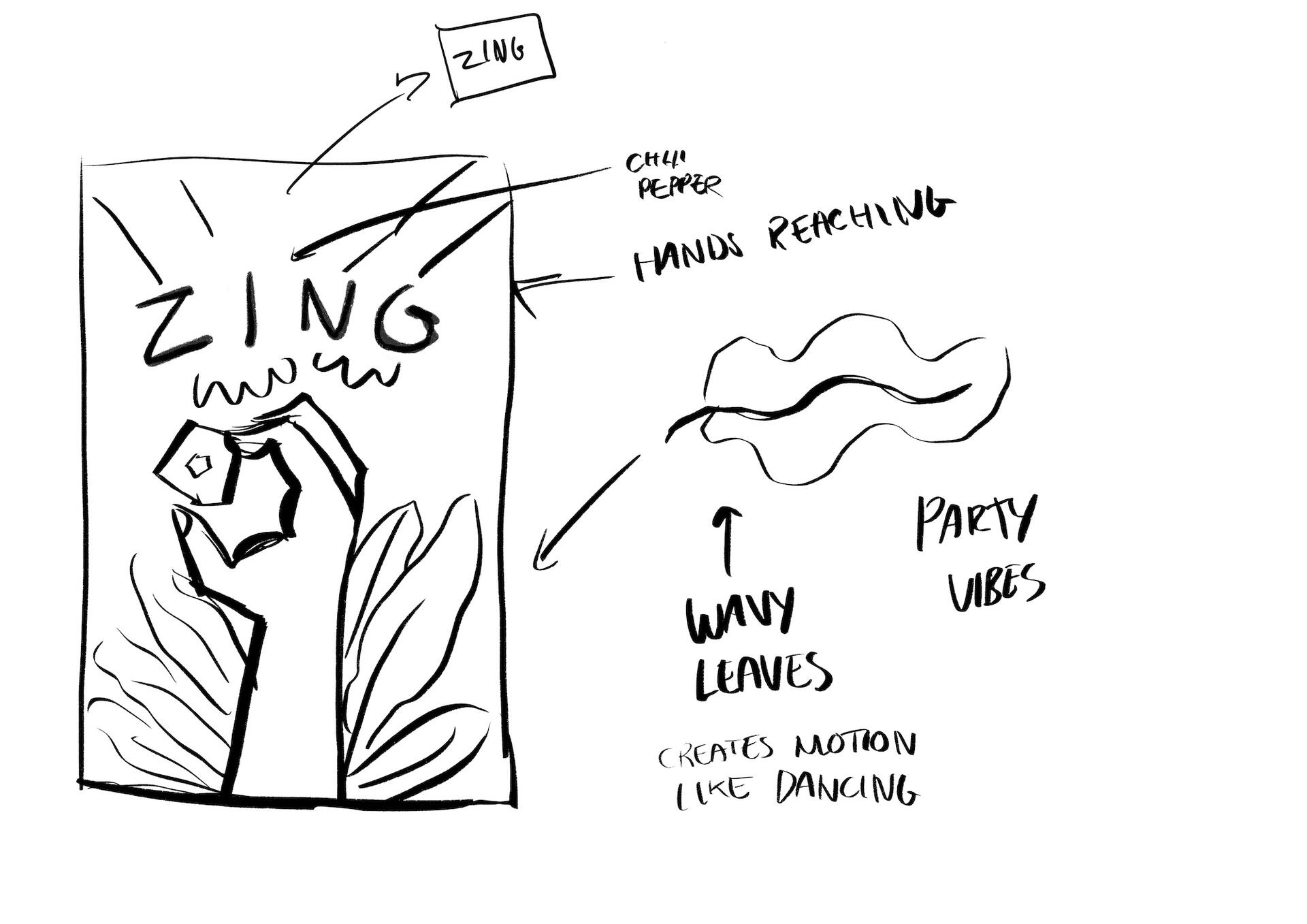
Concept Sketches
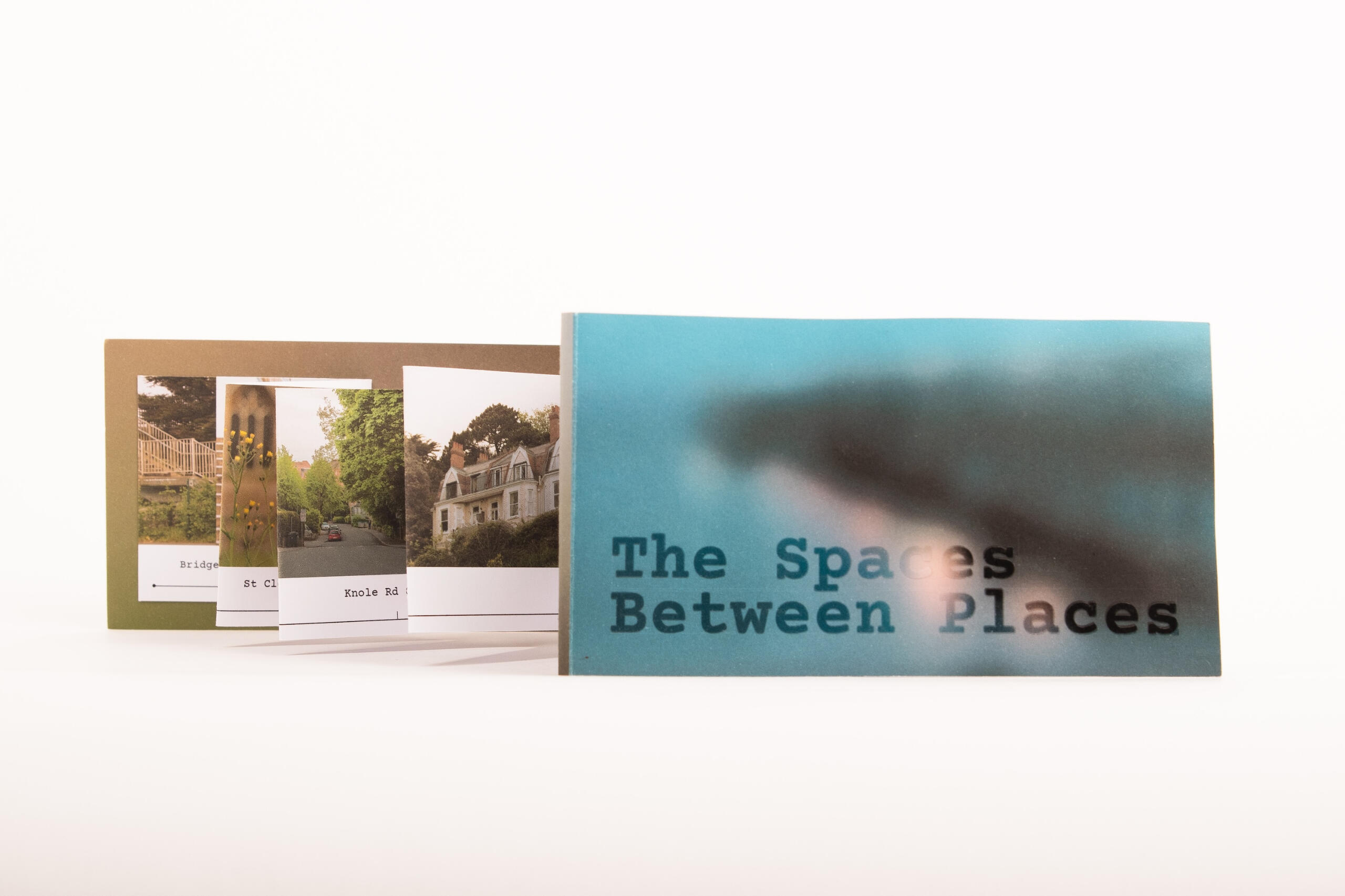
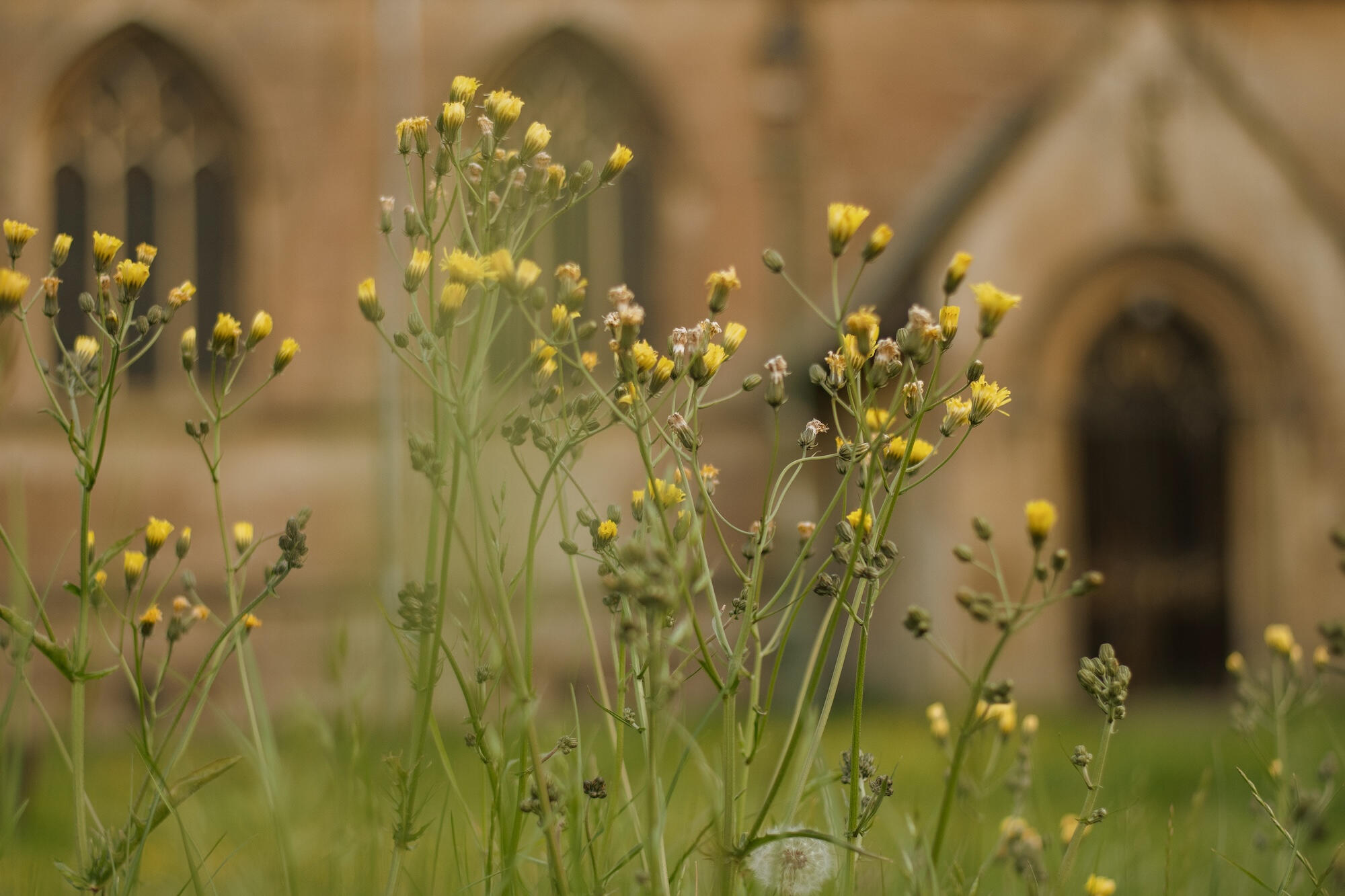
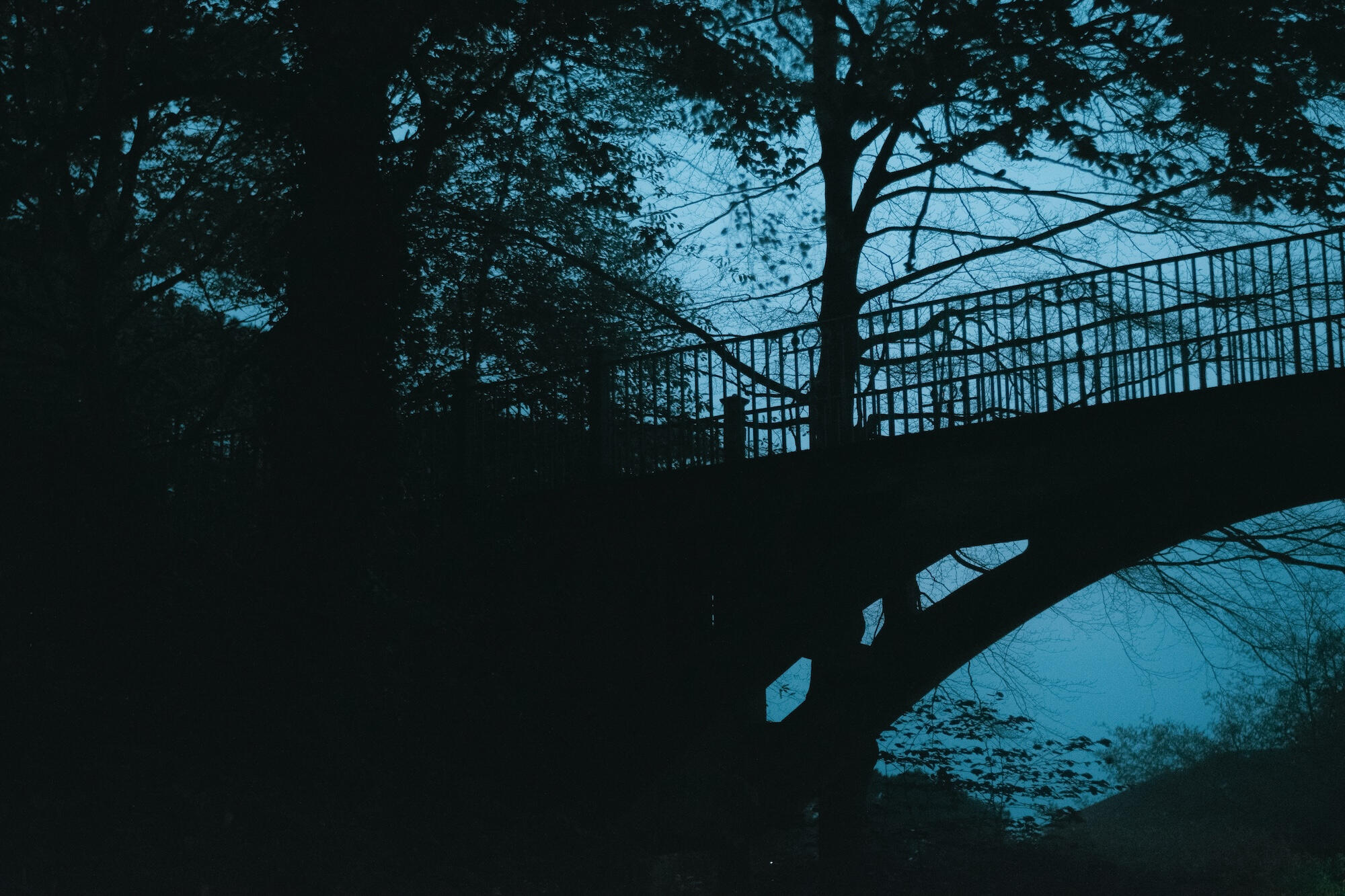
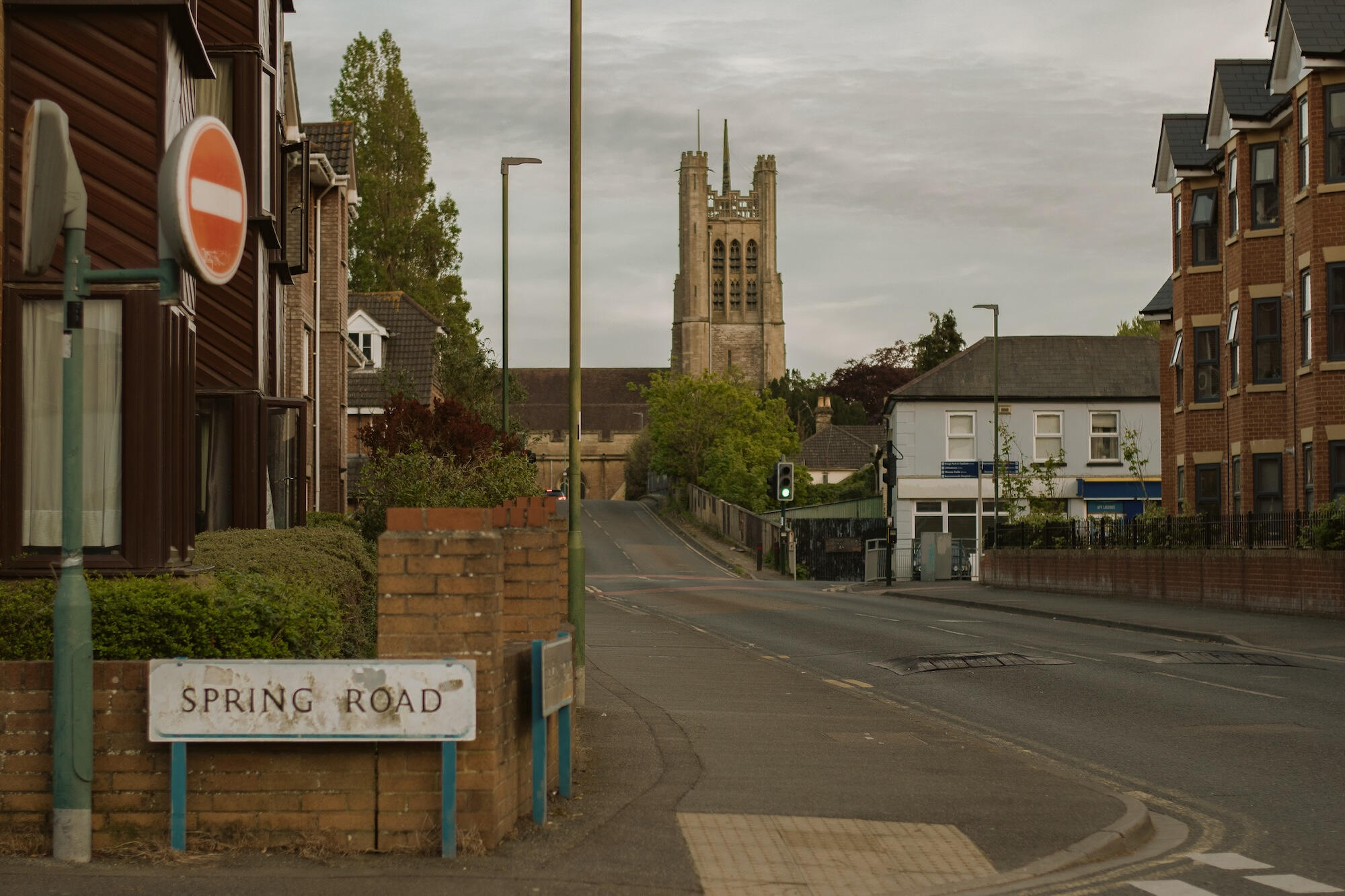
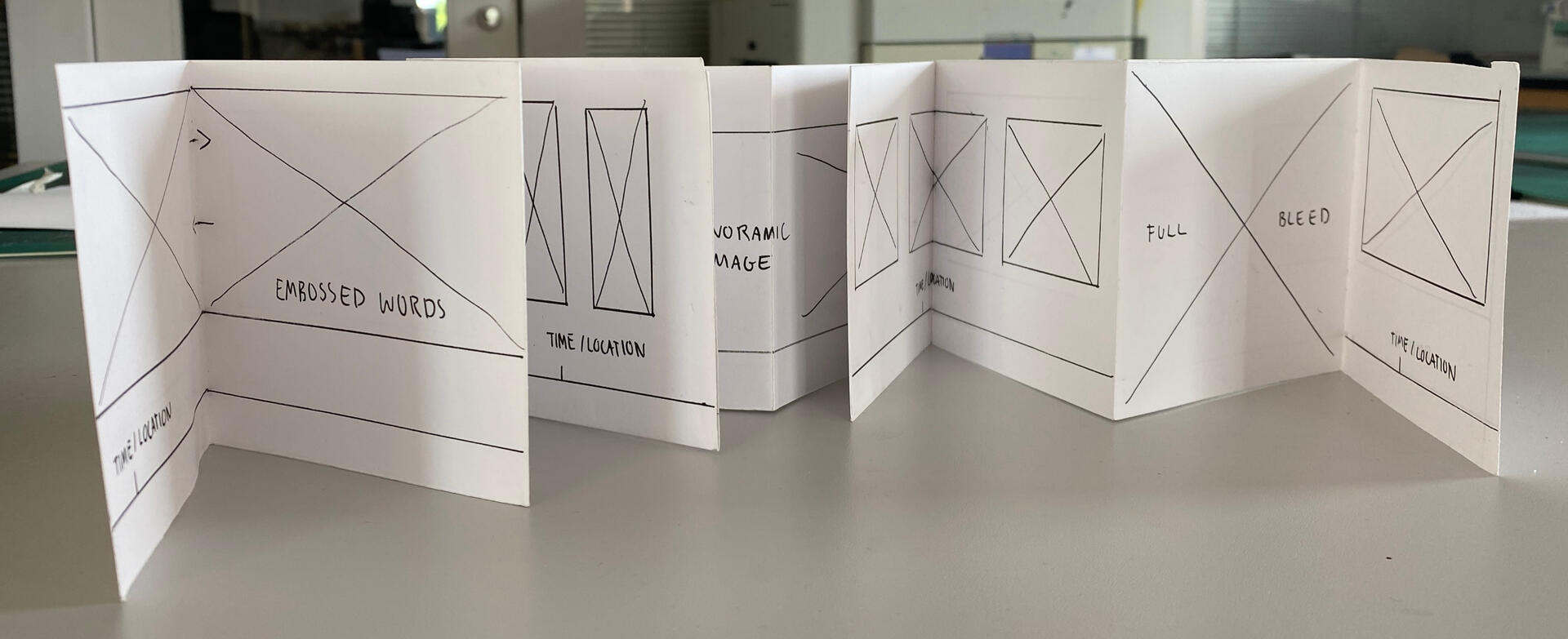
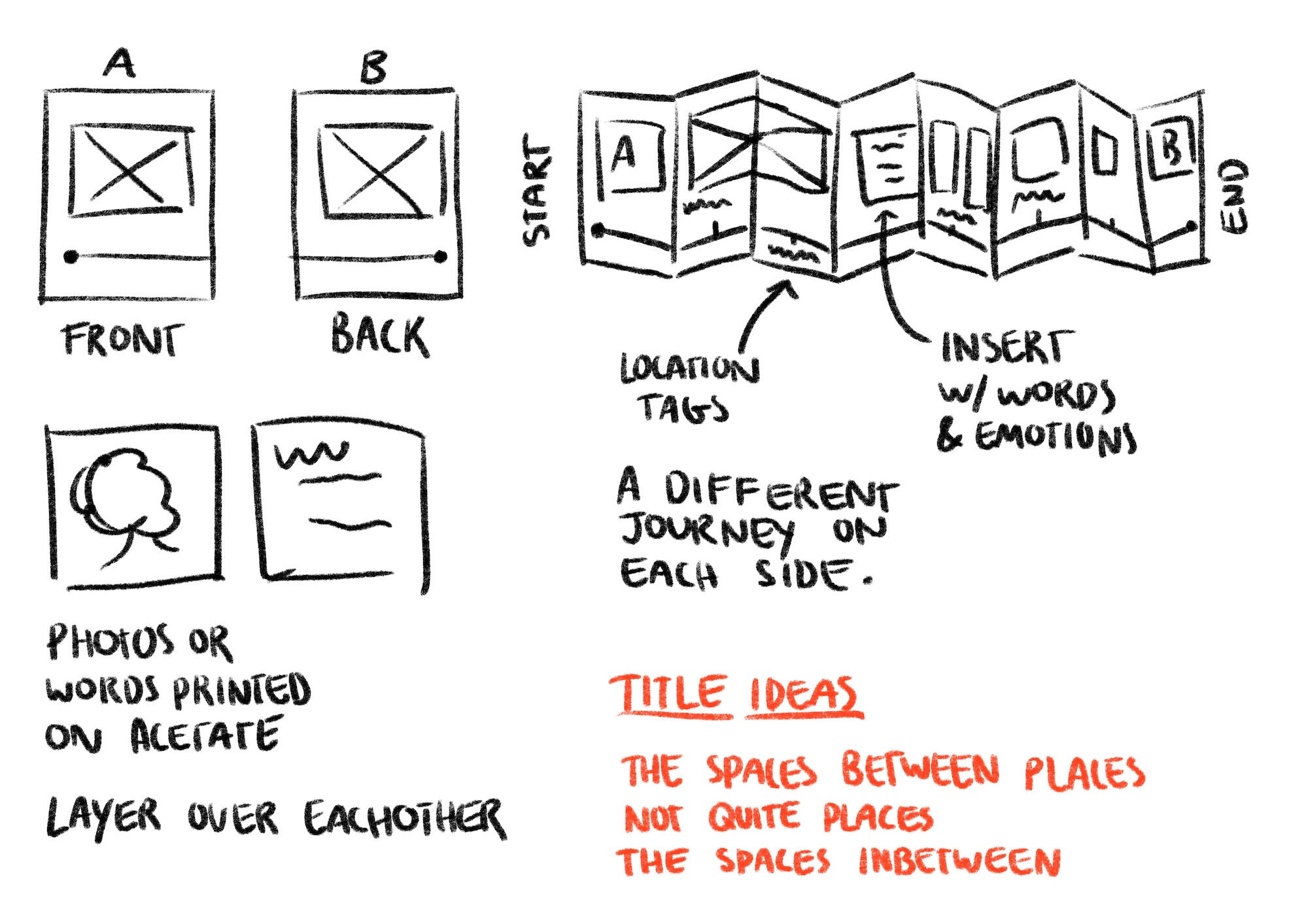
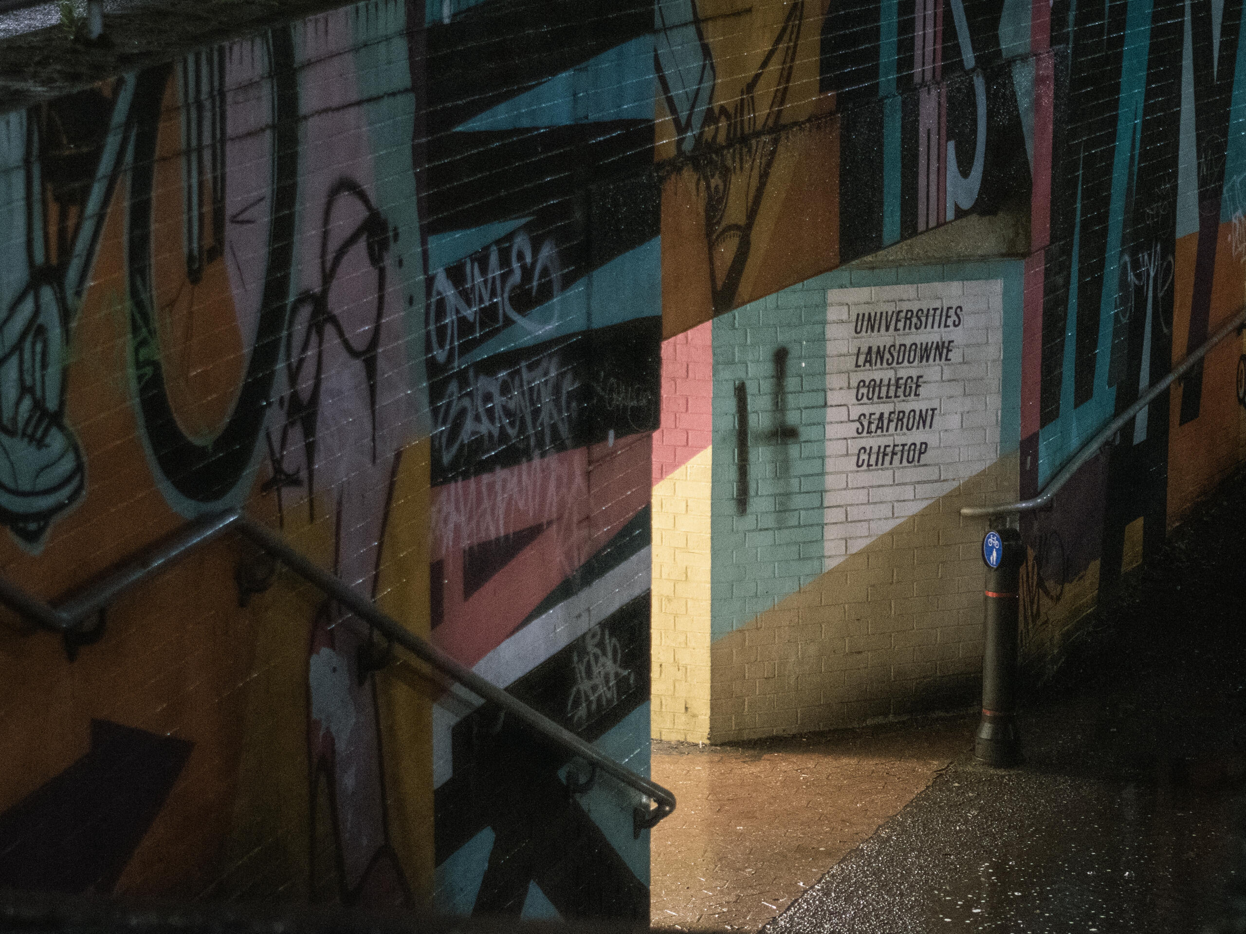
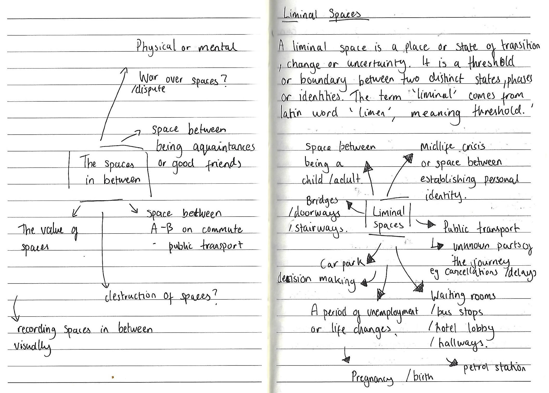
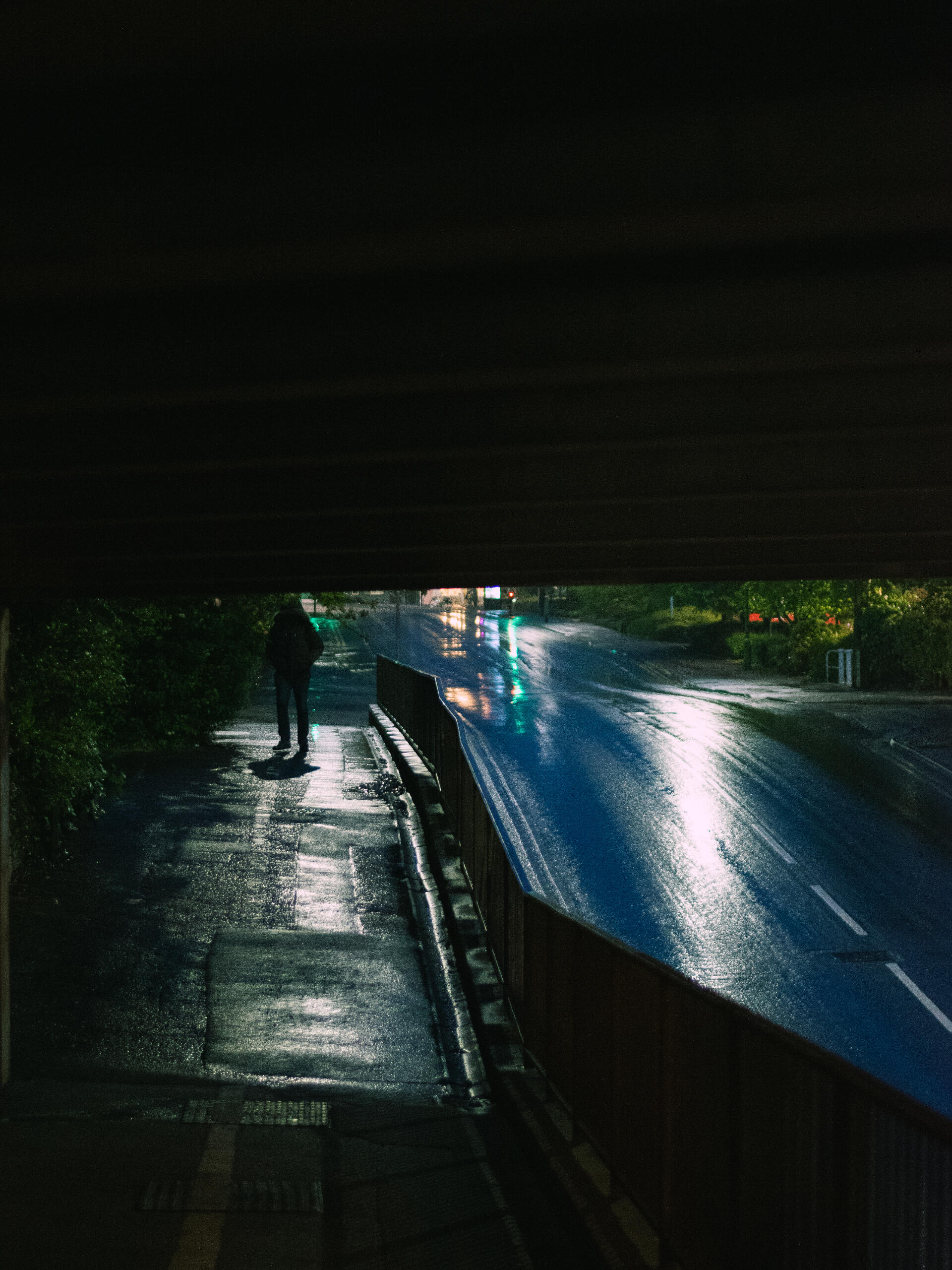
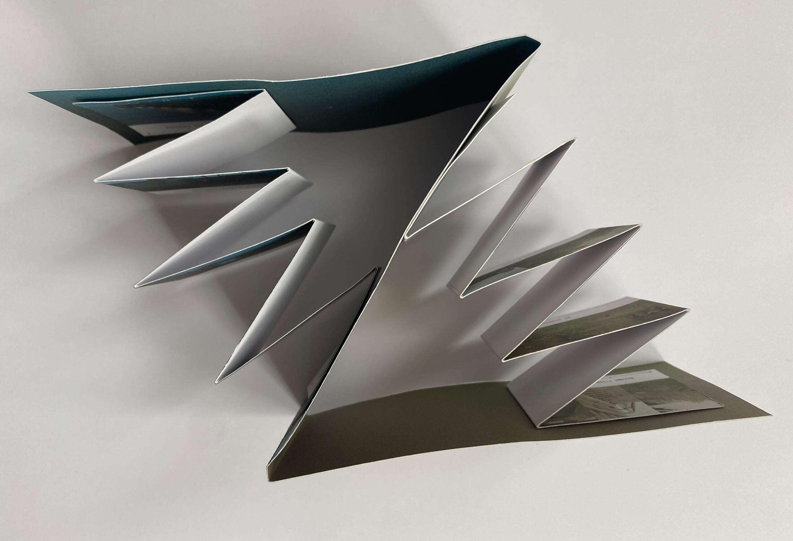
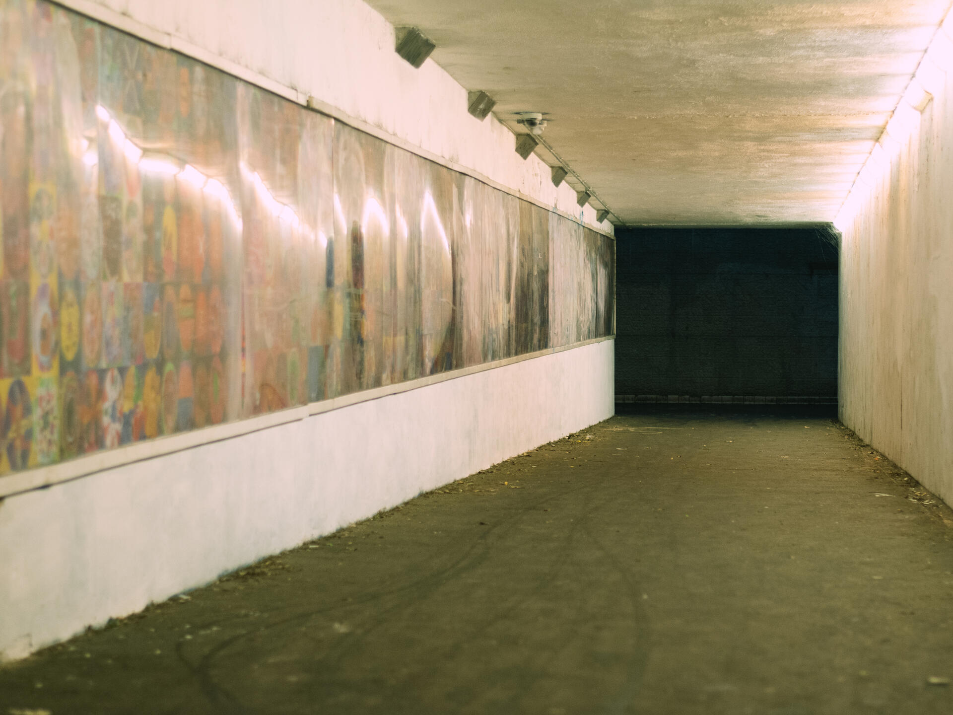
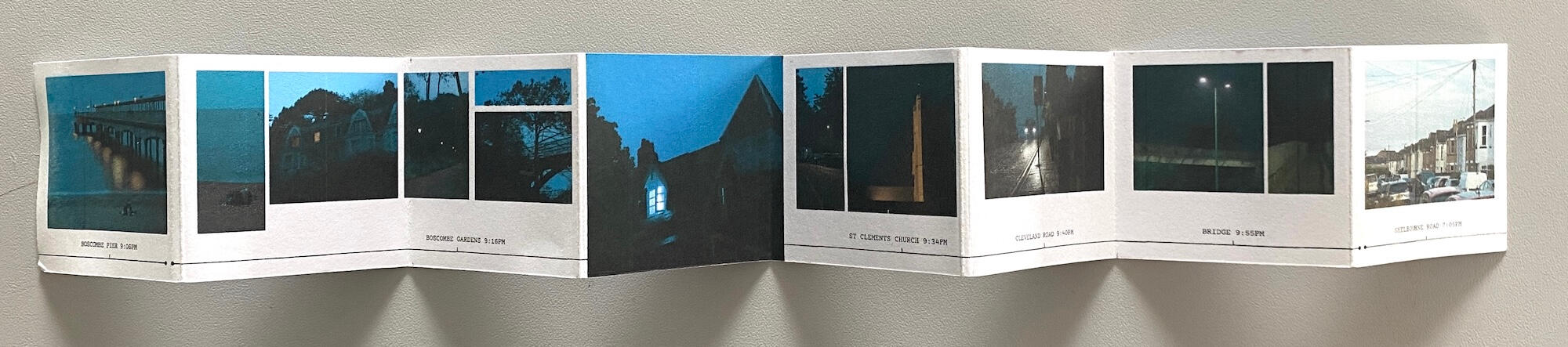
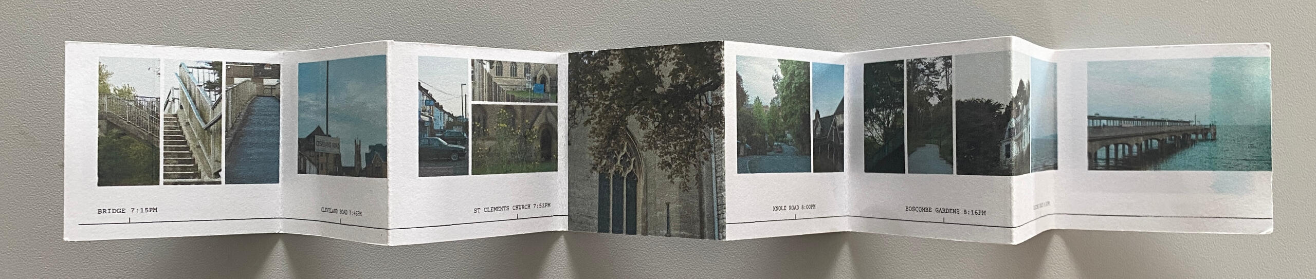
'The Spaces Between Places' is a conceptual project documenting the liminal space defined by a journey.
A liminal space is a place or state of transition, change or uncertainty. It is a threshold or boundary between two distinct states, phases or identities. My project focuses on a journey between my home and the beach, using form, colour, photography and layout to conceptualise this. The dos a dos cover allows the two parts of the journey to be viewed separately. The photography inside gives the viewer a sense of motion, showing the main landmark points of my journey.
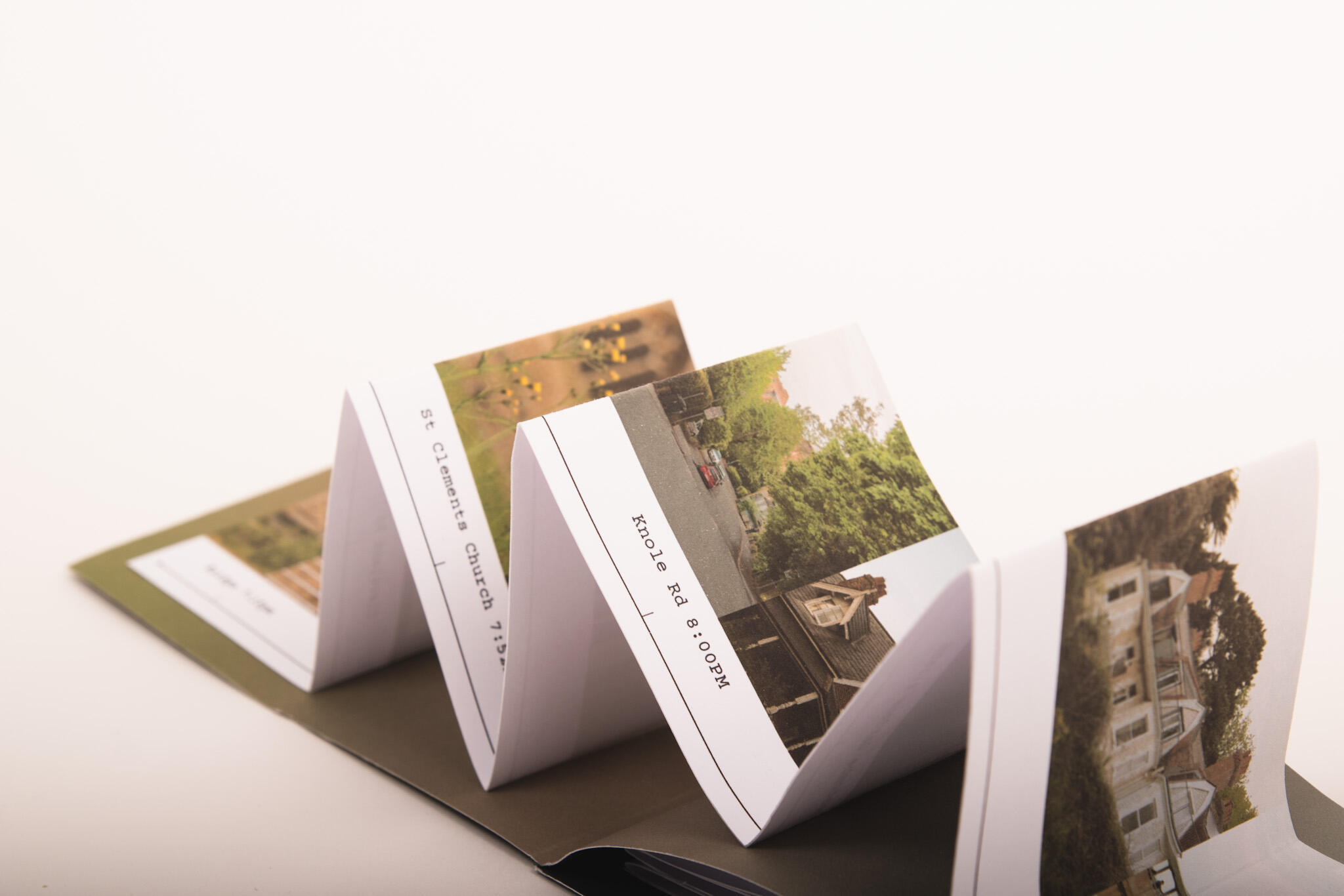
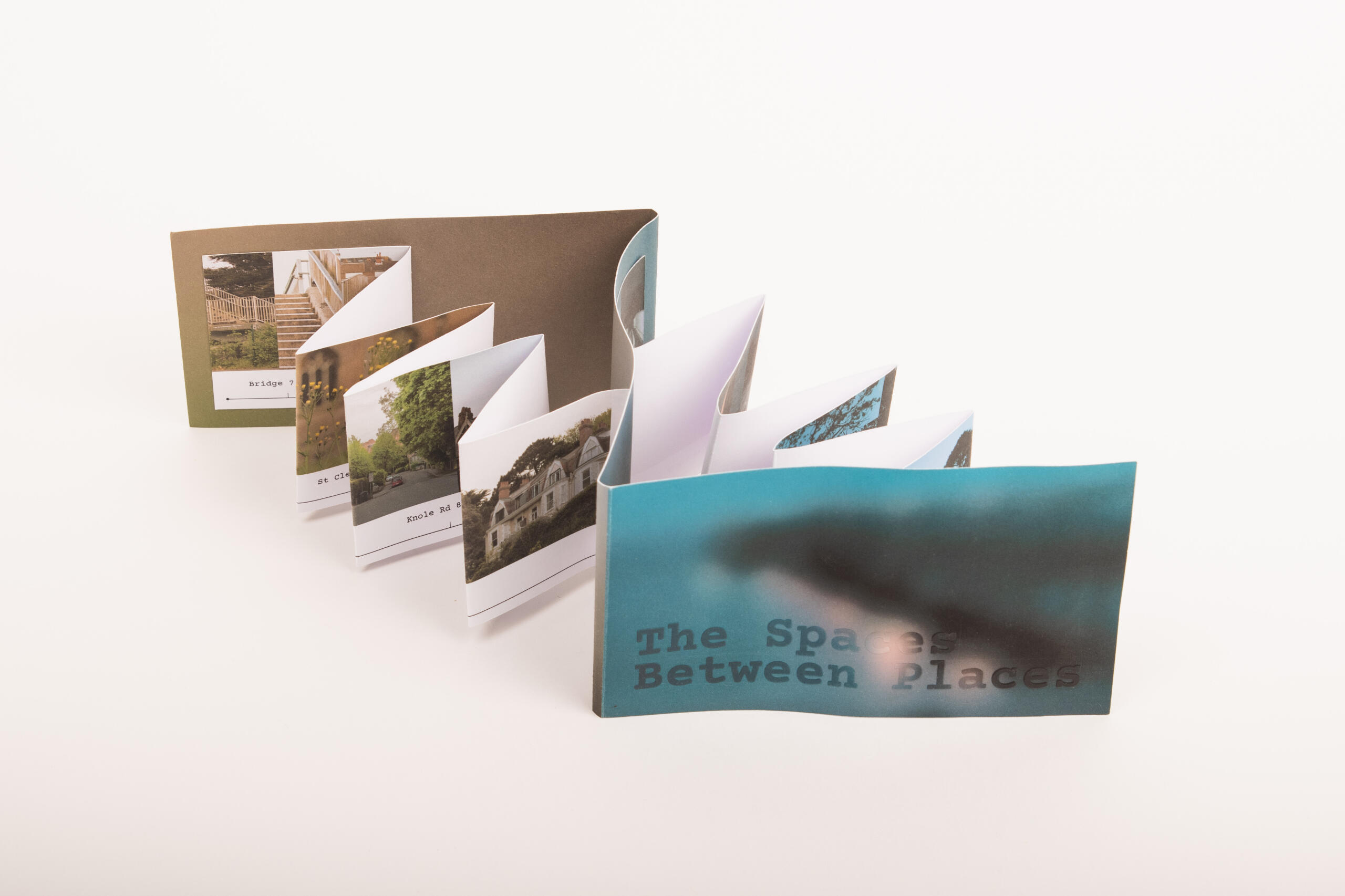
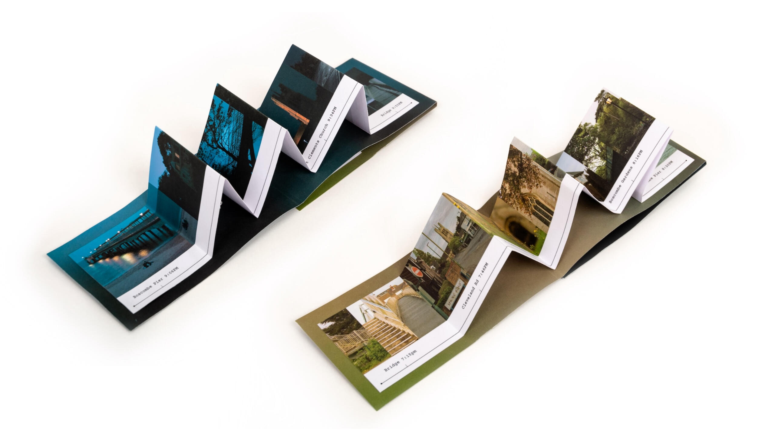
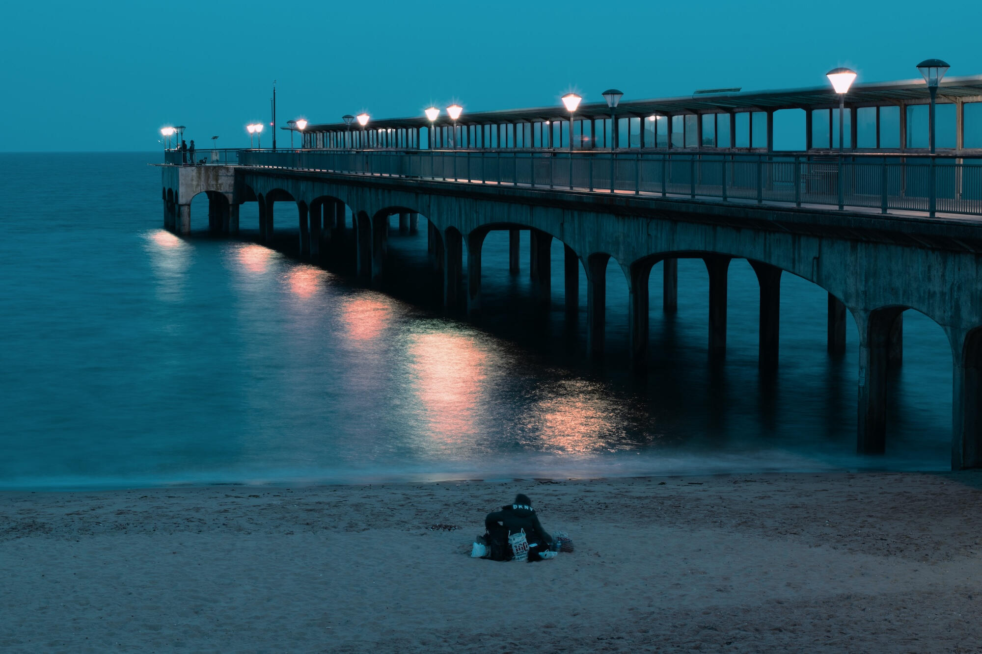
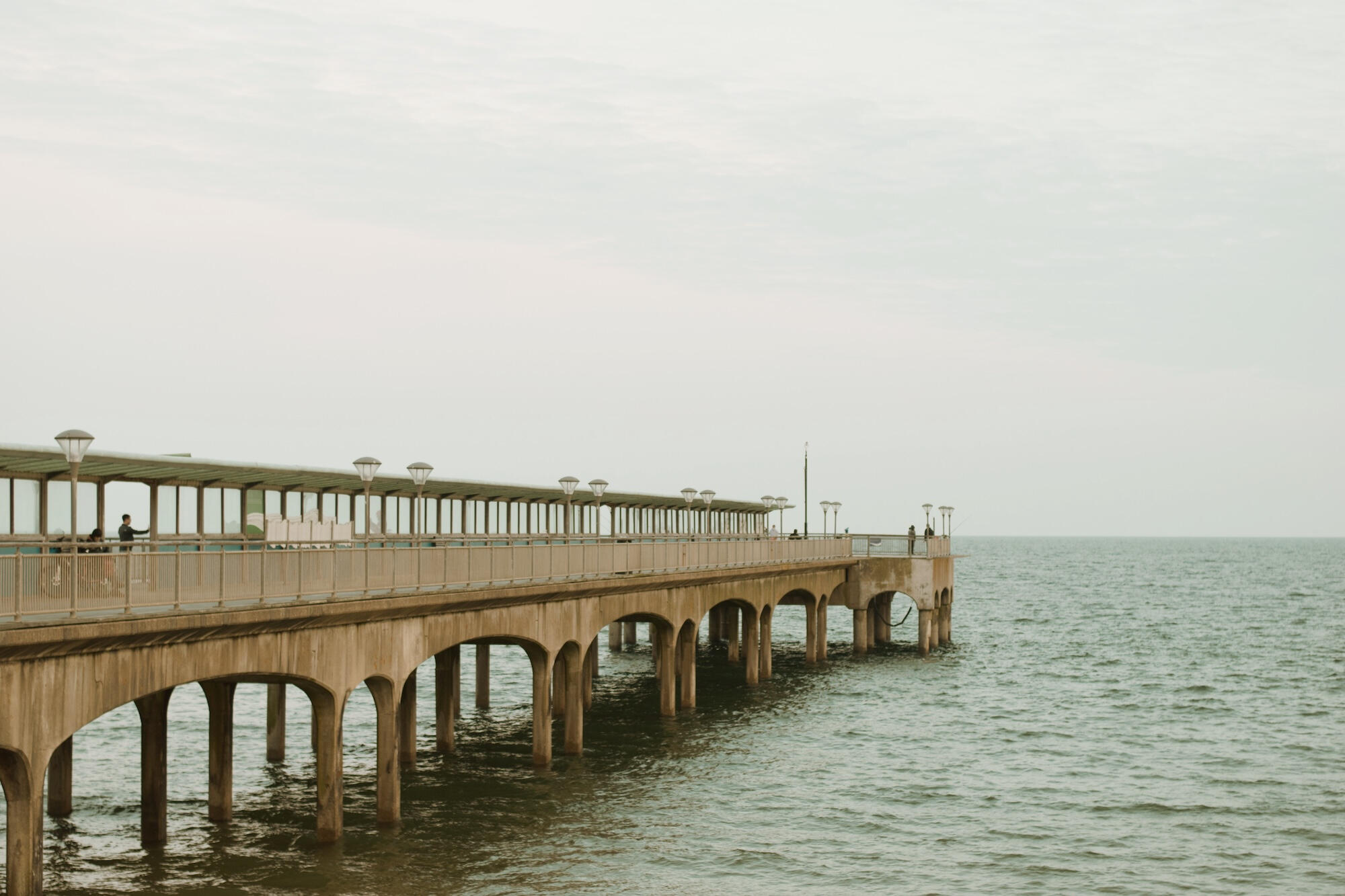
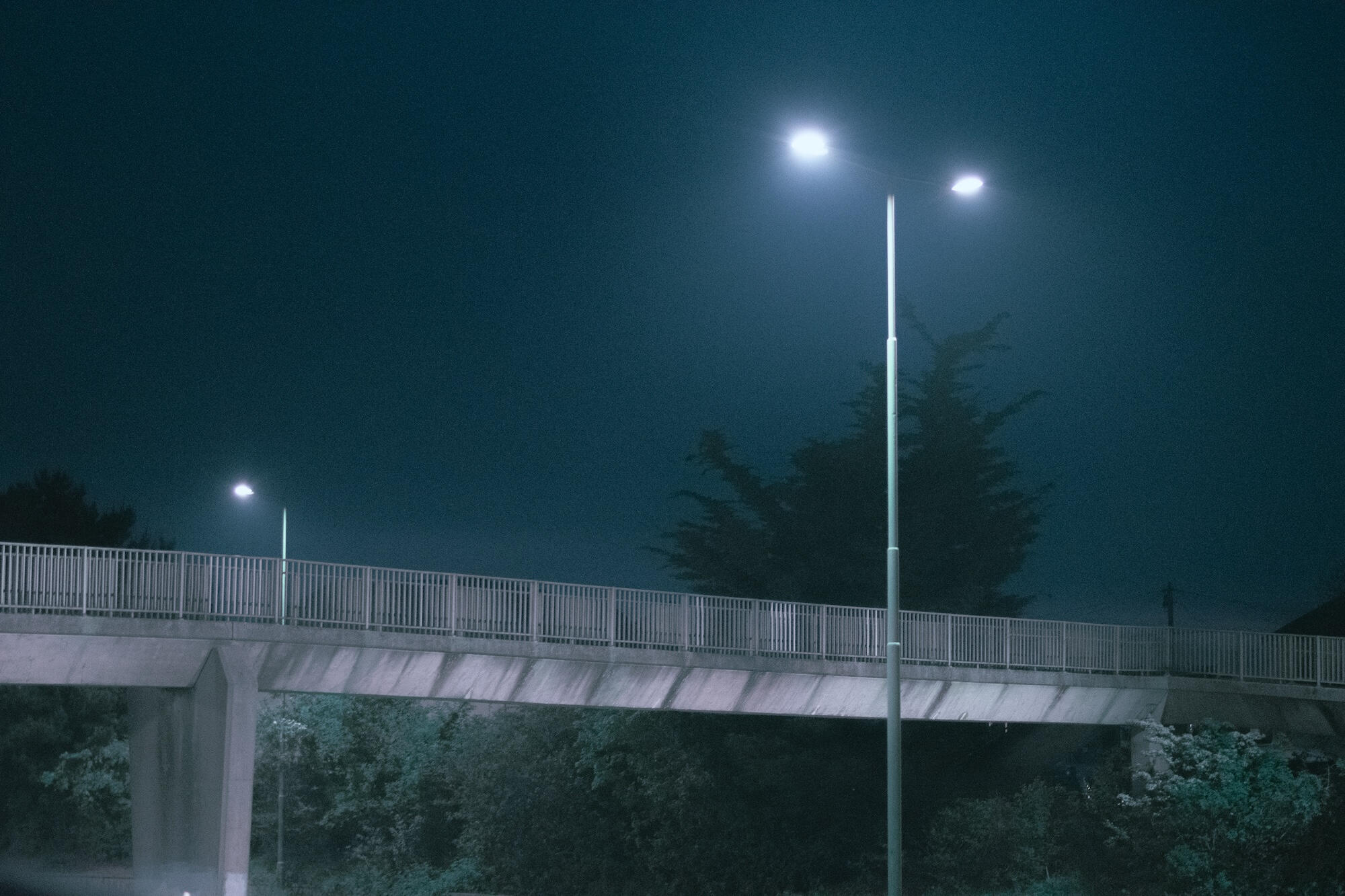
Photograph Selection
A close-up selection of the photography in the piece.
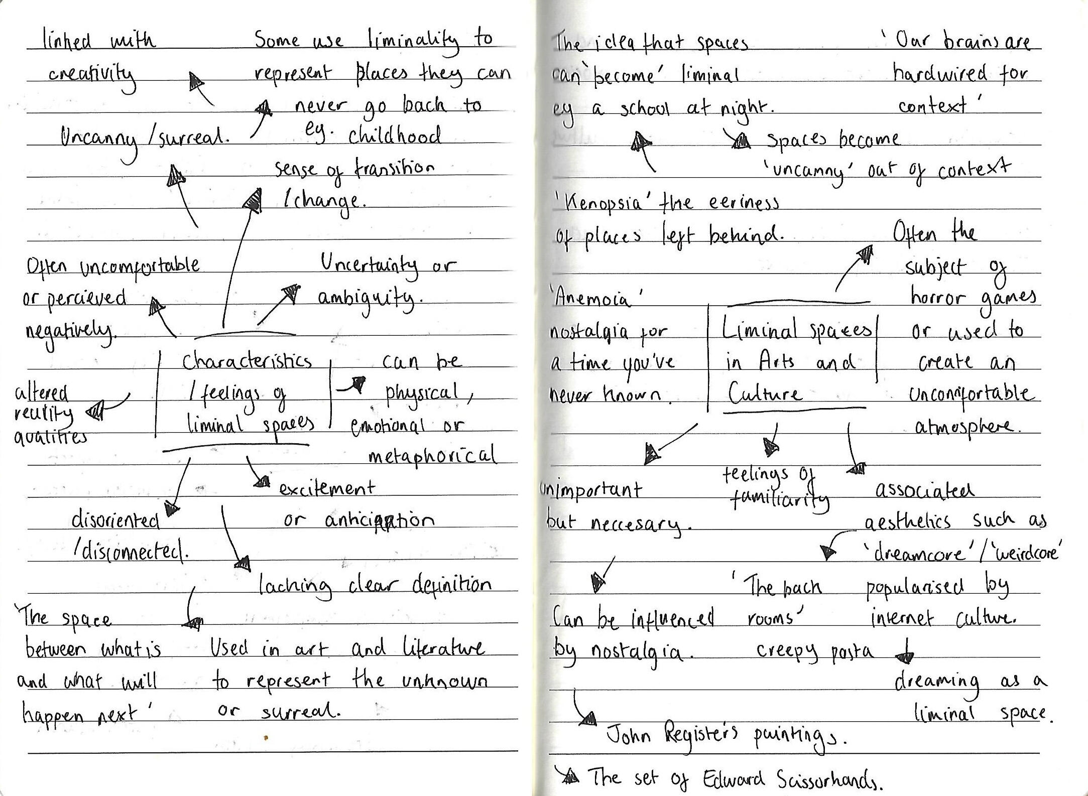
Development
I developed the project through photography experiments, research and prototypes.

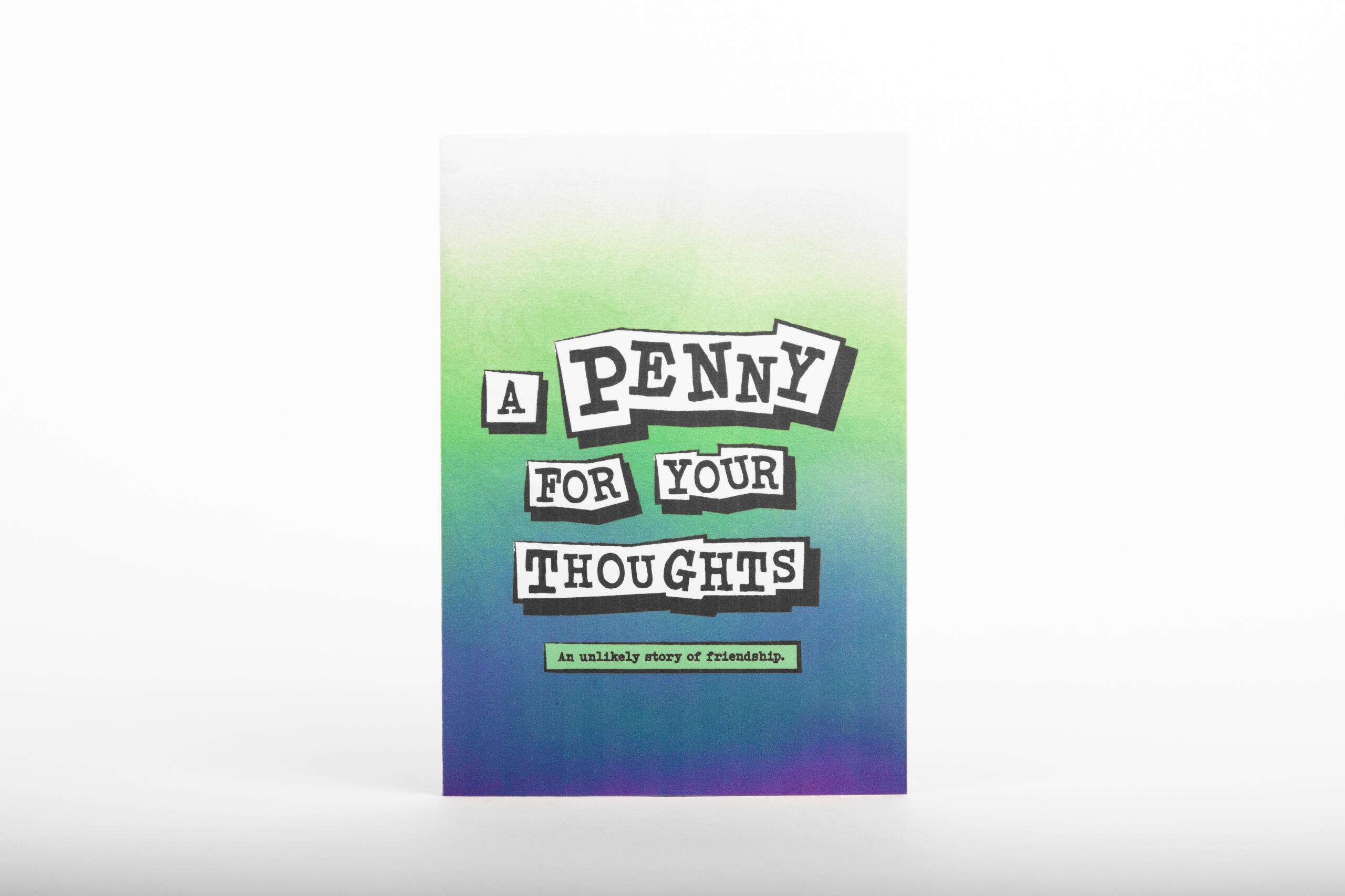
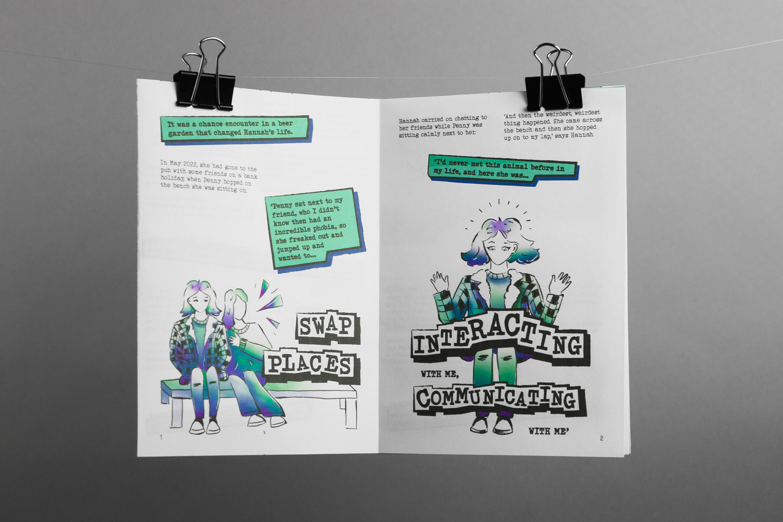
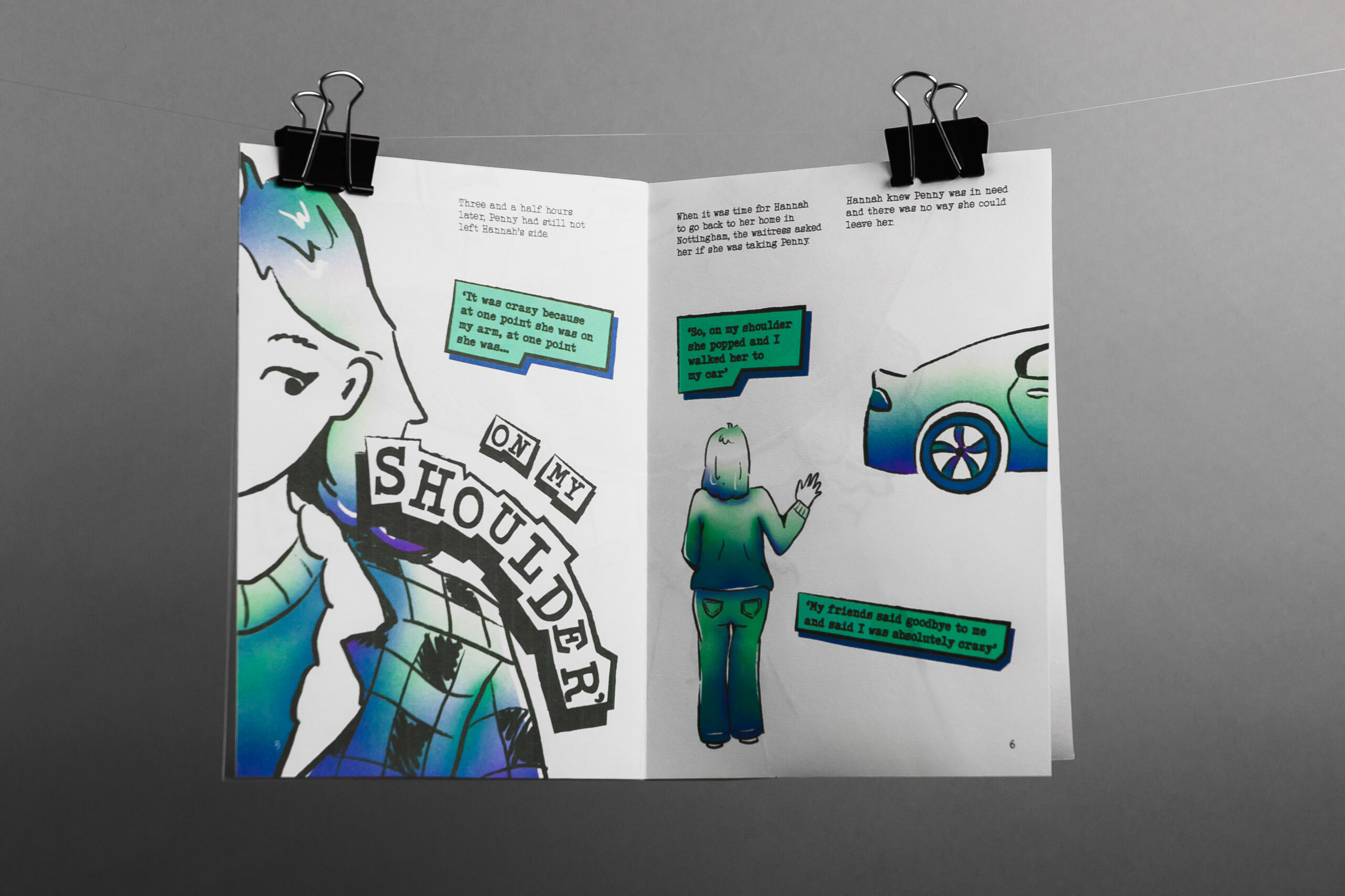
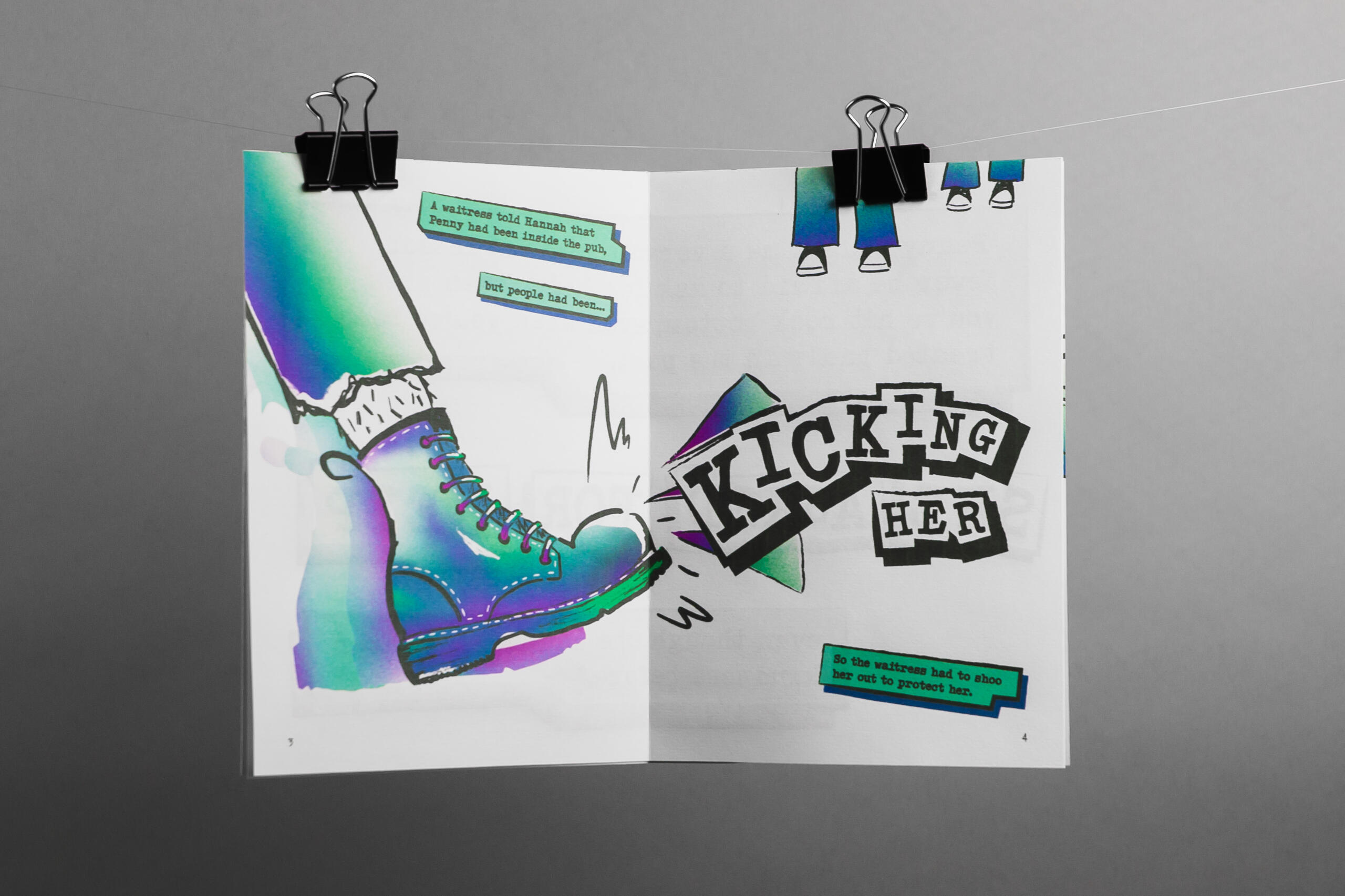
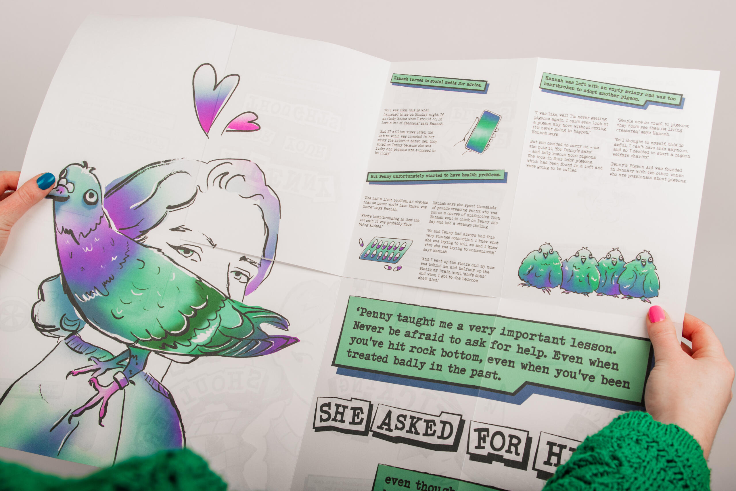
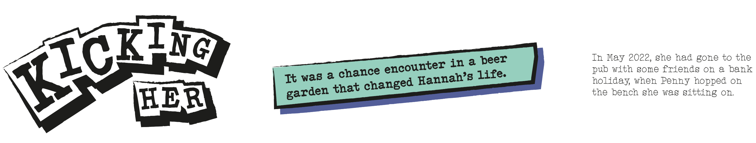
'A Penny For Your Thoughts' is a graphic novel that explores the relationship between humans and pigeons by documenting the true story of Hannah and her pet pigeon, Penny.
It aims to make us rethink how we treat animals that we perceive to be vermin. The inside spreads tell the story whilst concealing Penny’s identity to prevent bias or assumptions. Her identity is revealed at the end when the novel is opened out into a large poster with an illustration of Penny and Hannah.
Text Styles
The text styles differentiate the hierachy of information in the graphic novel and are influenced by zine culture. The large cut out style text conceals and represents Penny and her interactions. The text boxes draw attention to important parts of the story and the smaller body text tells the rest. The typeface used is ‘Click Clack’, a typewriter font, in various weights.
Colour Palette
The colour palette subtly references the iridescent feathers of a pigeon’s neck.

Illustration Style
The illustrations are inspired by graphic novels, comics and zines. The textured line art style pairs well with the borders of the text boxes and the weight of the typeface. It highlights the beautiful feathers of a pigeon using the purples greens and blues as part of a gradient.

Process Book
Below is a sample of some spreads from my process book that was used to document the development of this project. They show my research into zine culture and the problem my design aims to solve.


Development


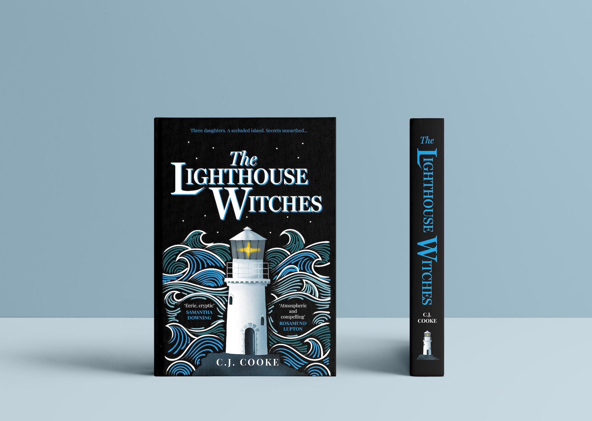
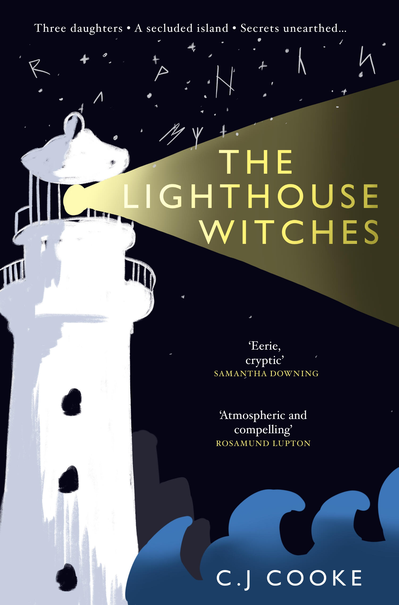
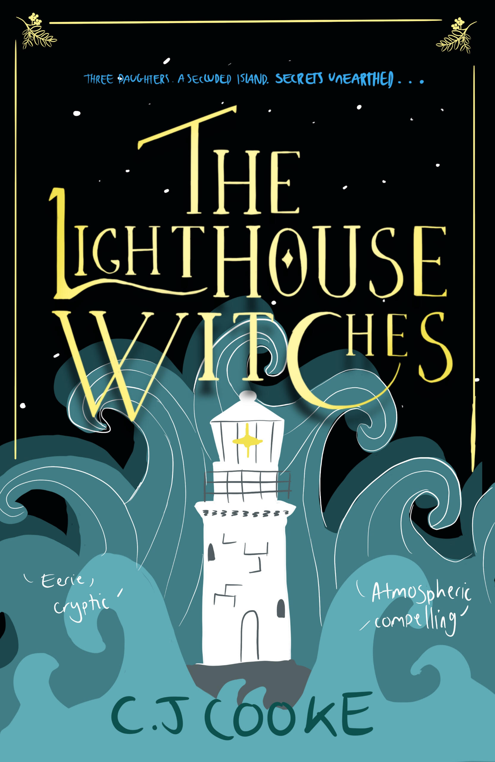
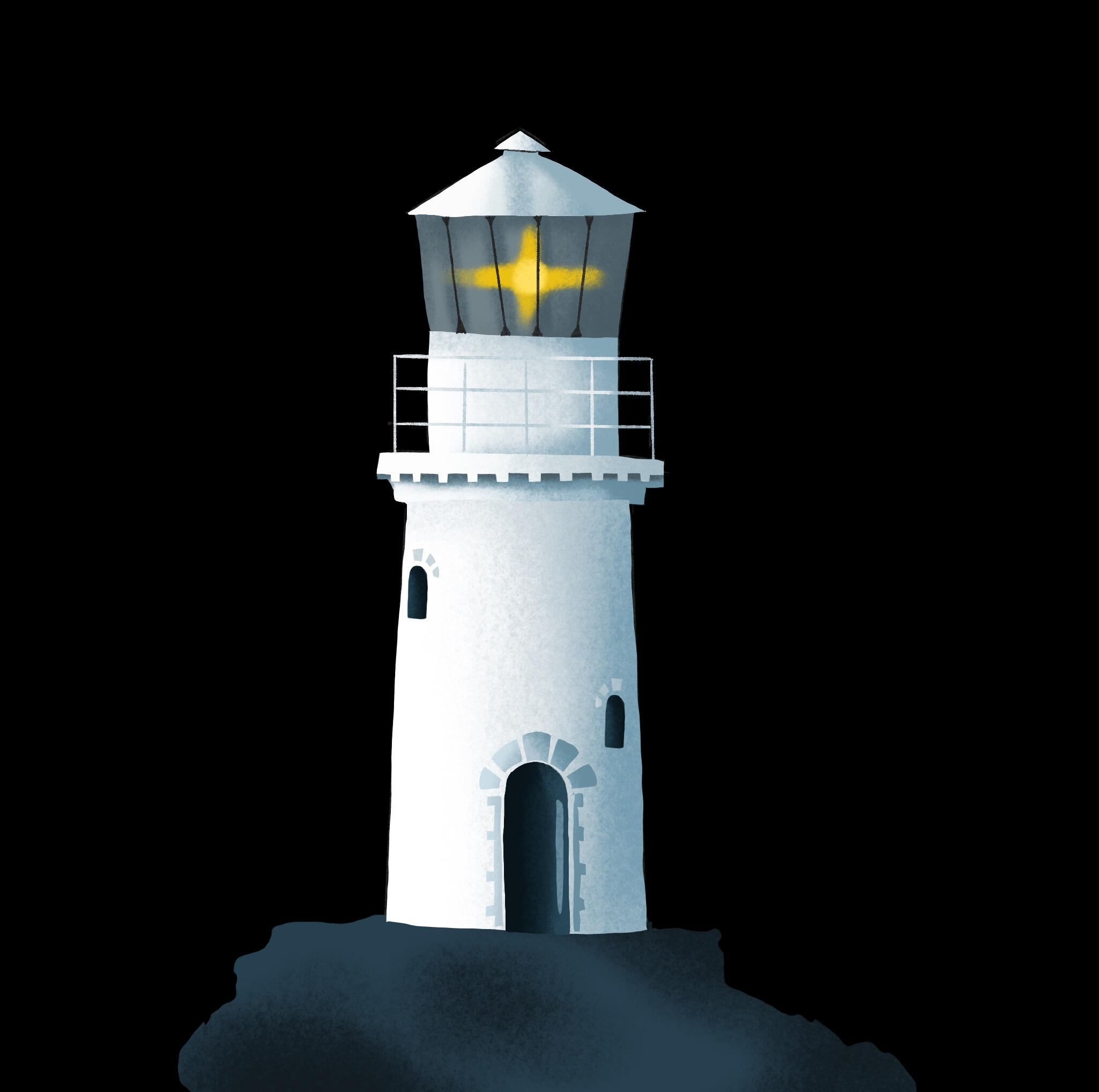
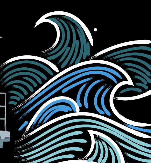
A re-imagined cover for 'The Lighthouse Witches' by C.J. Cooke.
I was inspired by the book's rugged setting on the Scottish coastline and its dark, eerie themes. I used Procreate to create some layout sketches exploring colour, type and illustration styles.
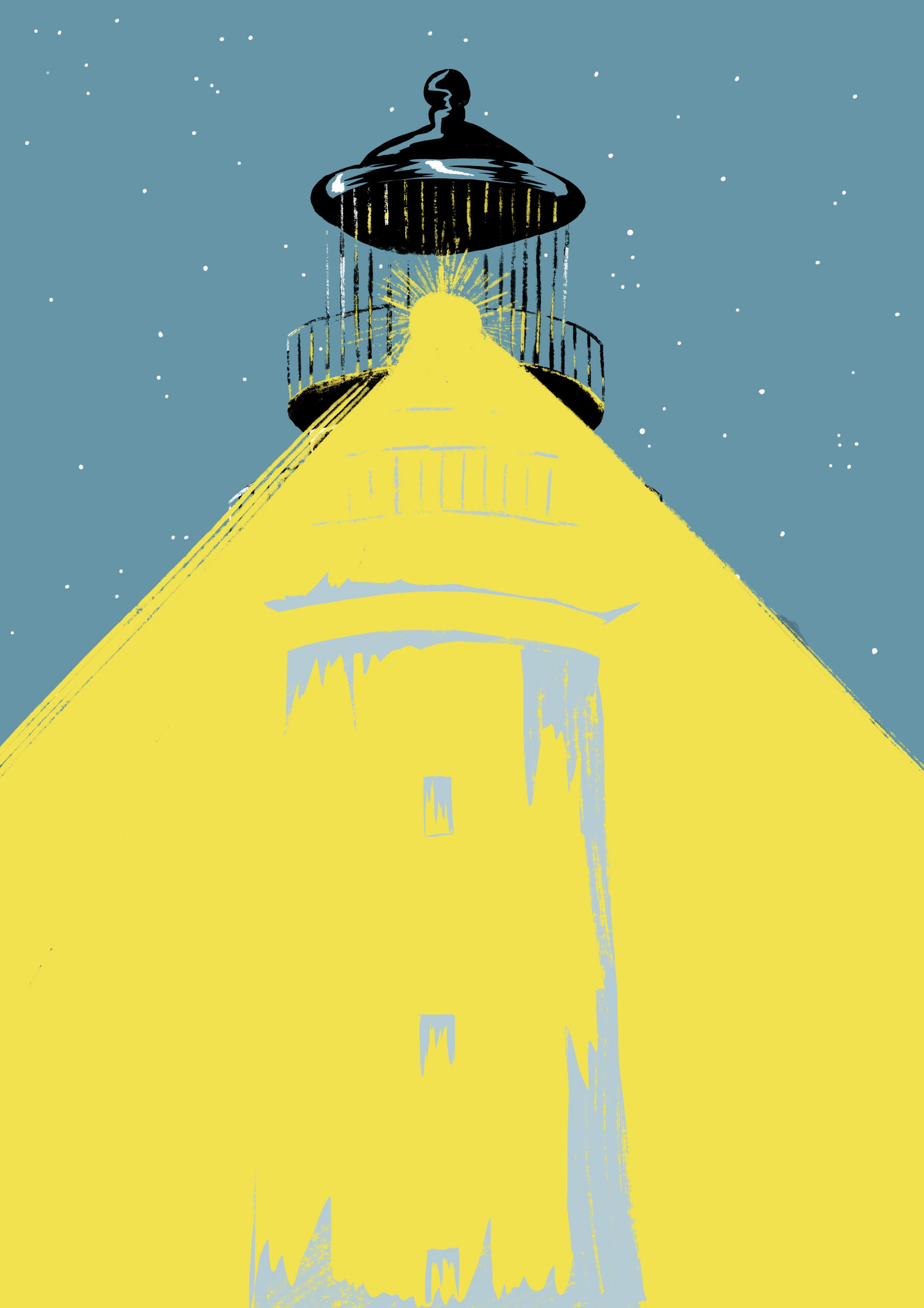
Illustrations
These are my final illustrations. I used Procreate to draw the lighthouse and Illustrator with a Wacom tablet to create some vector brushstroke waves.
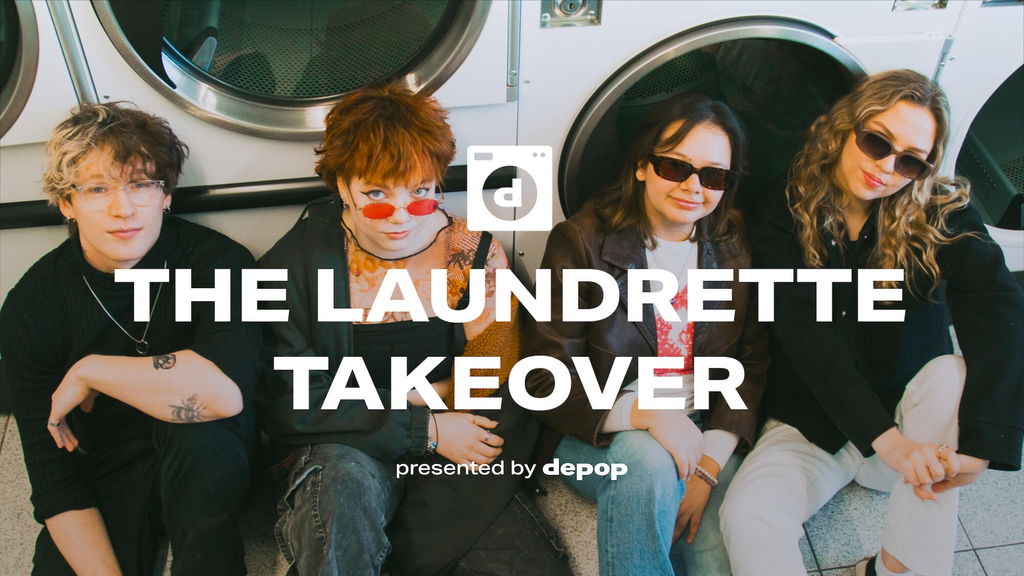
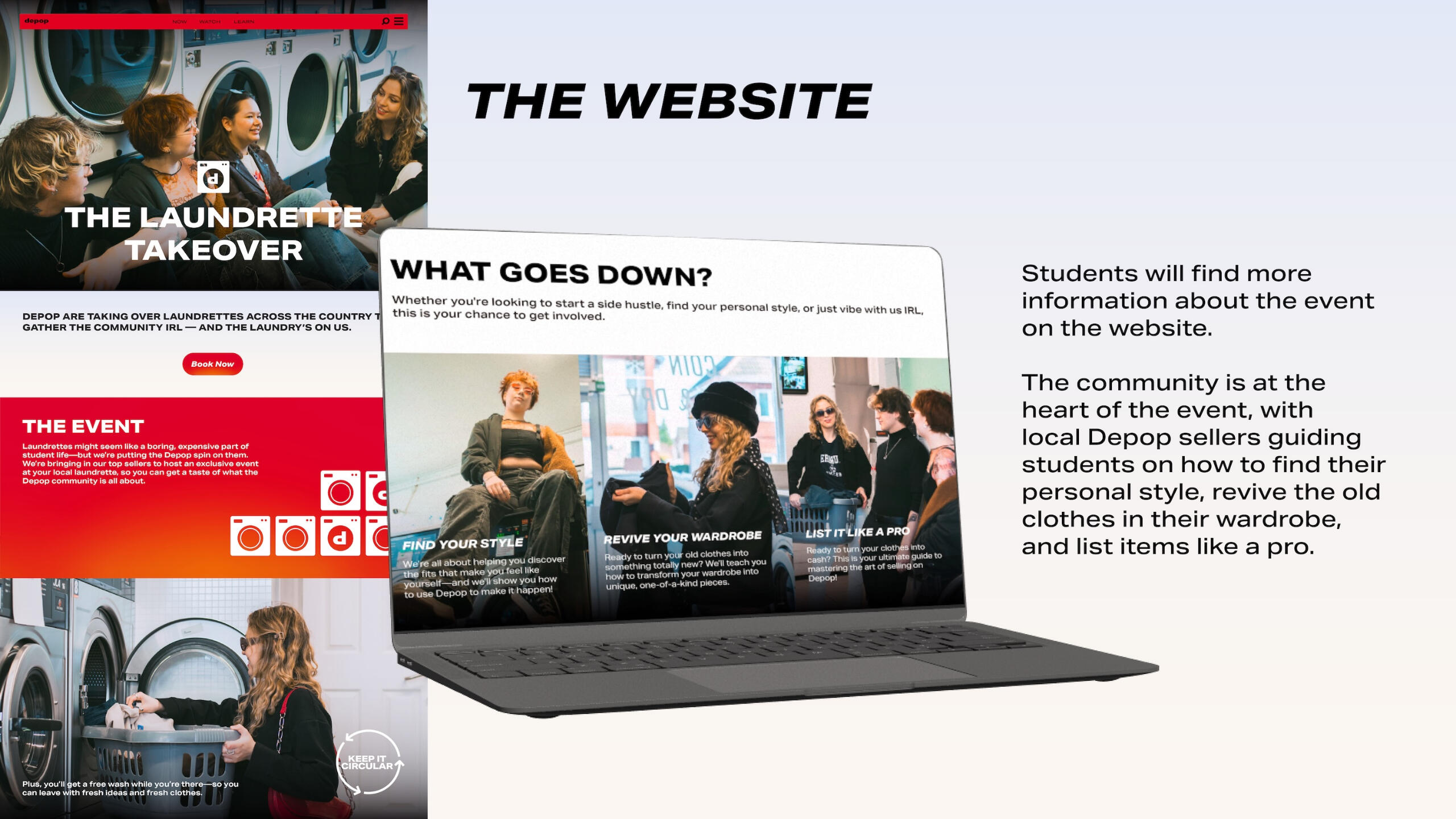
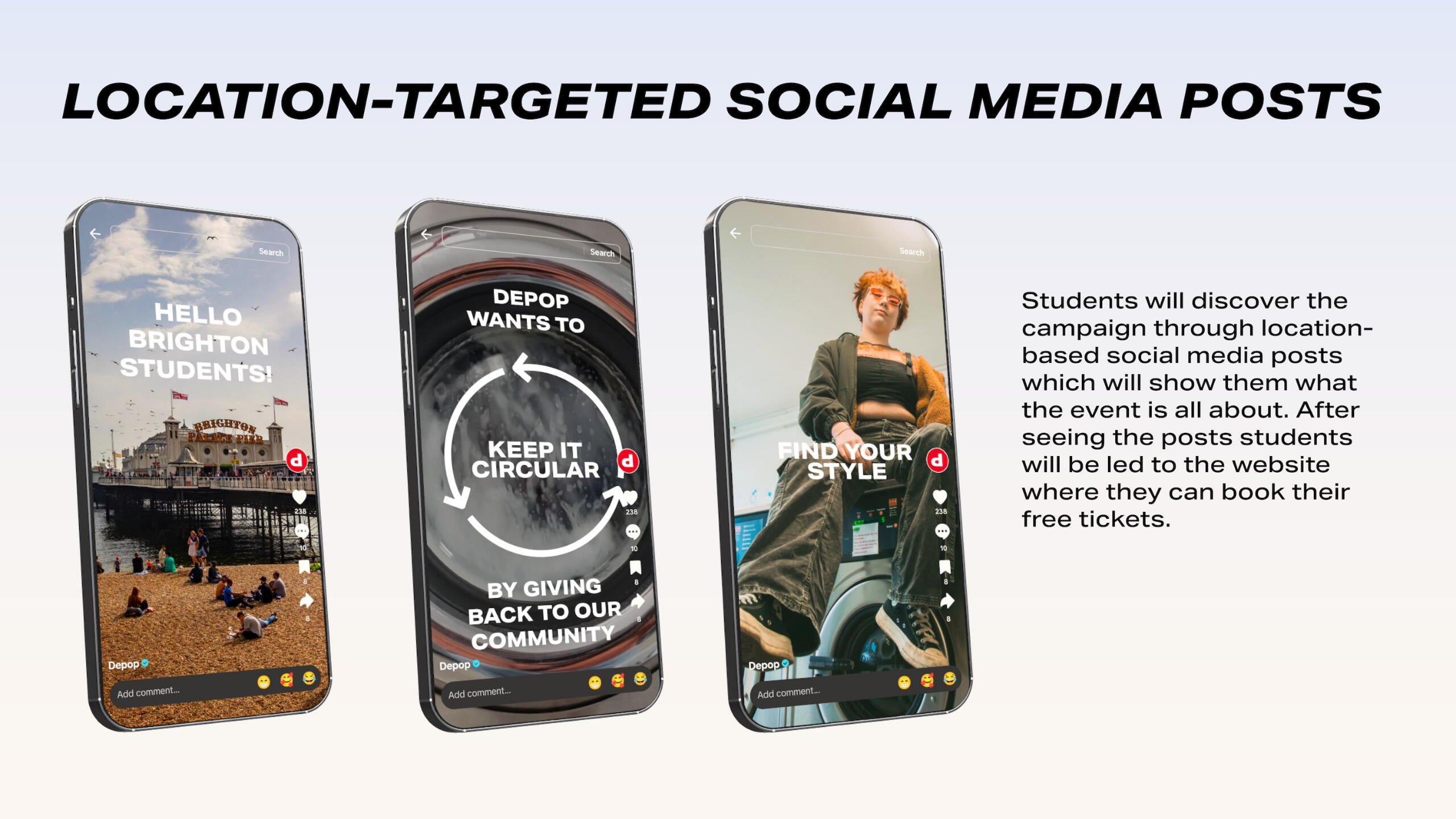
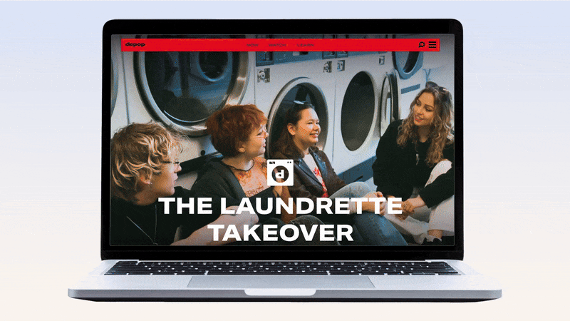
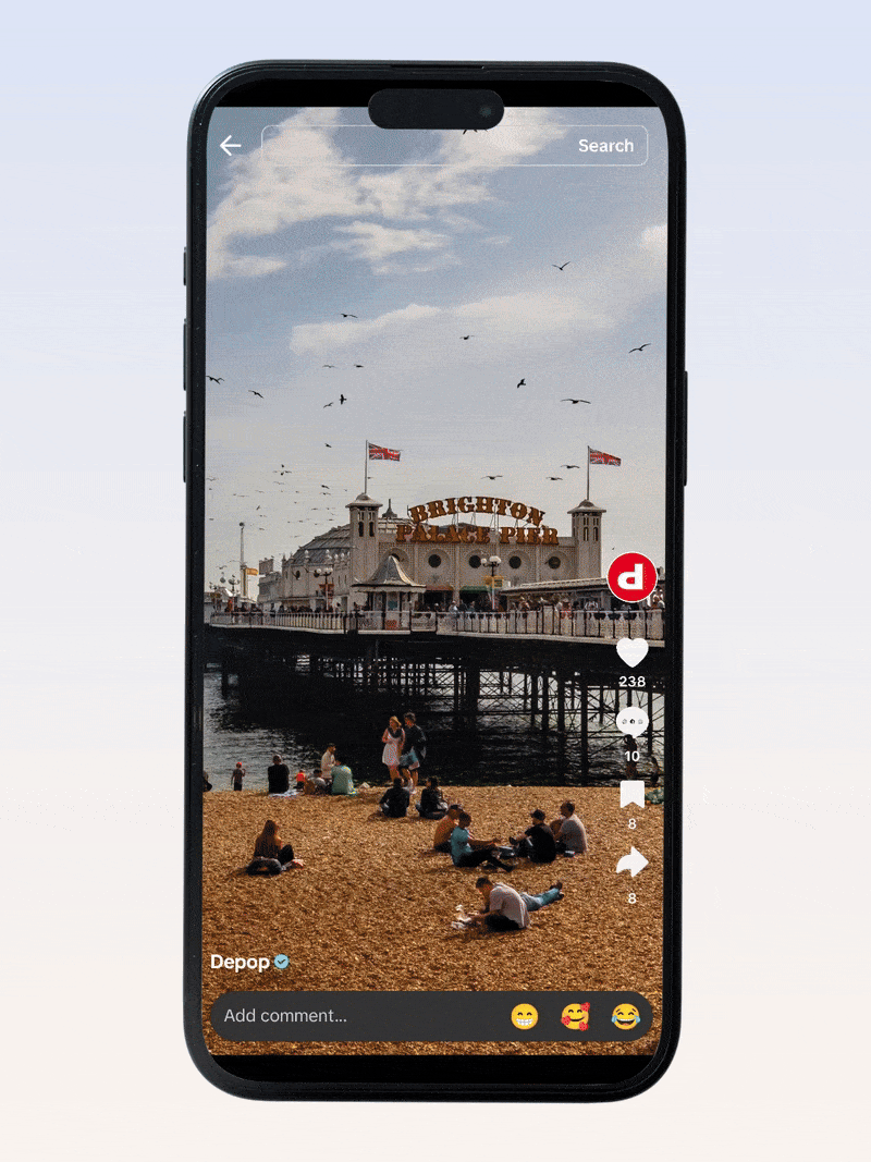
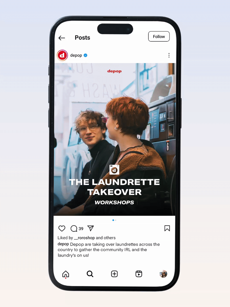
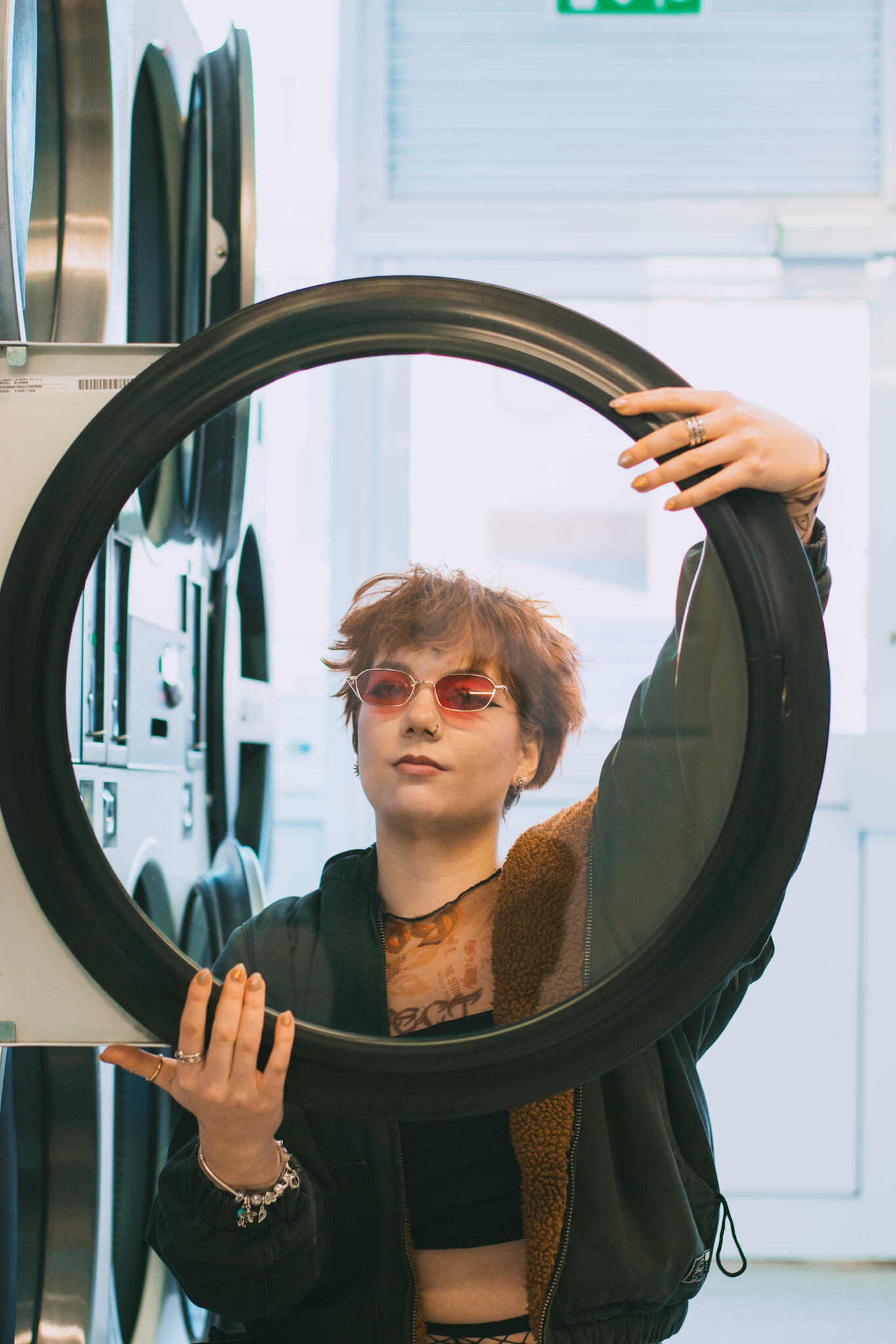
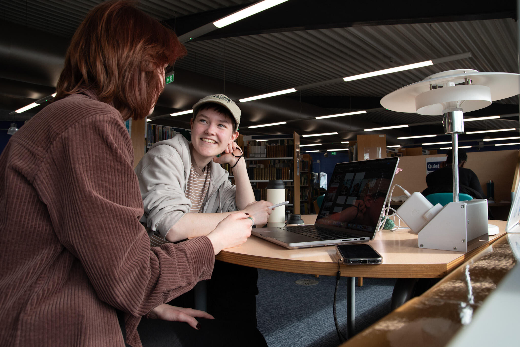
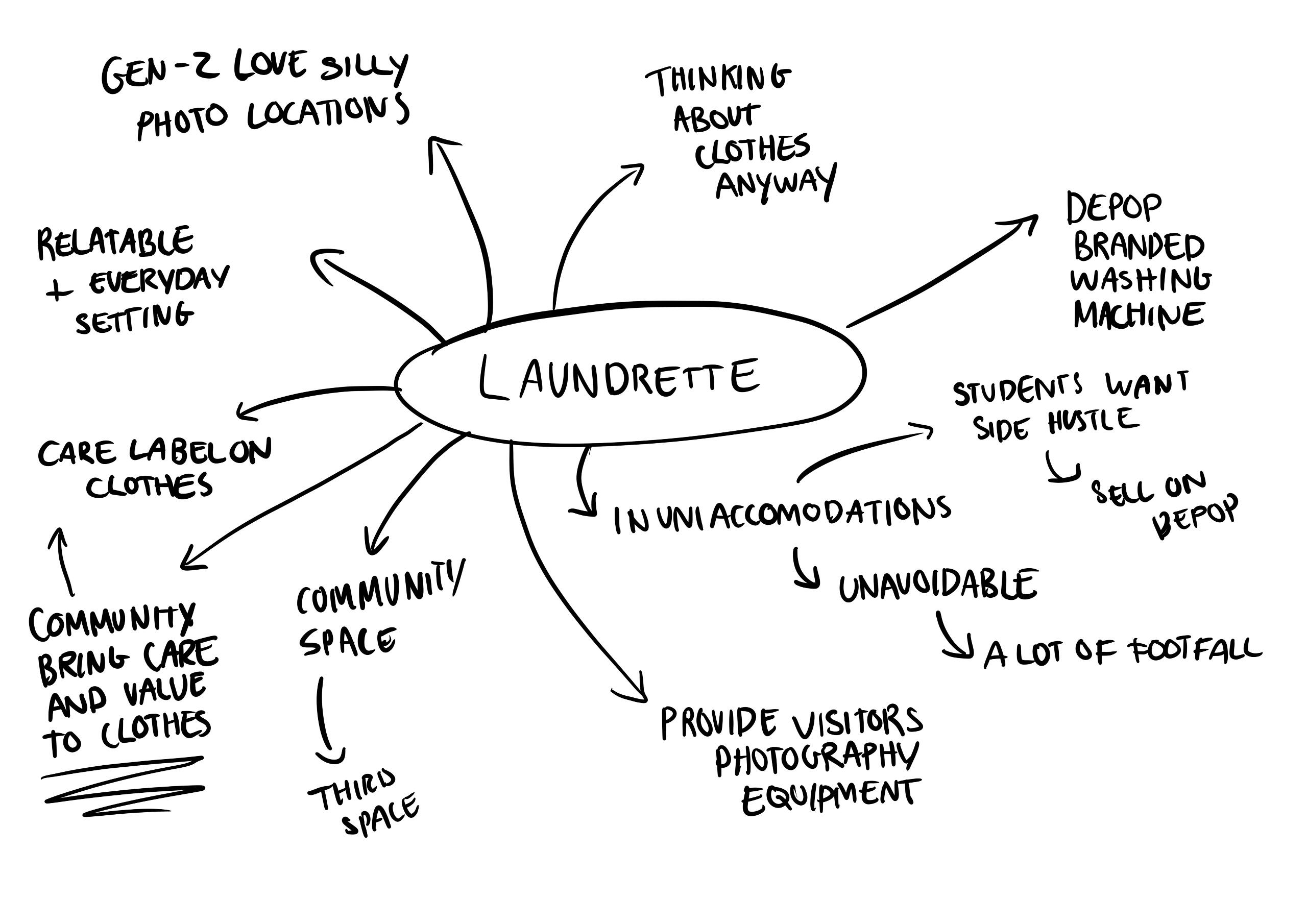
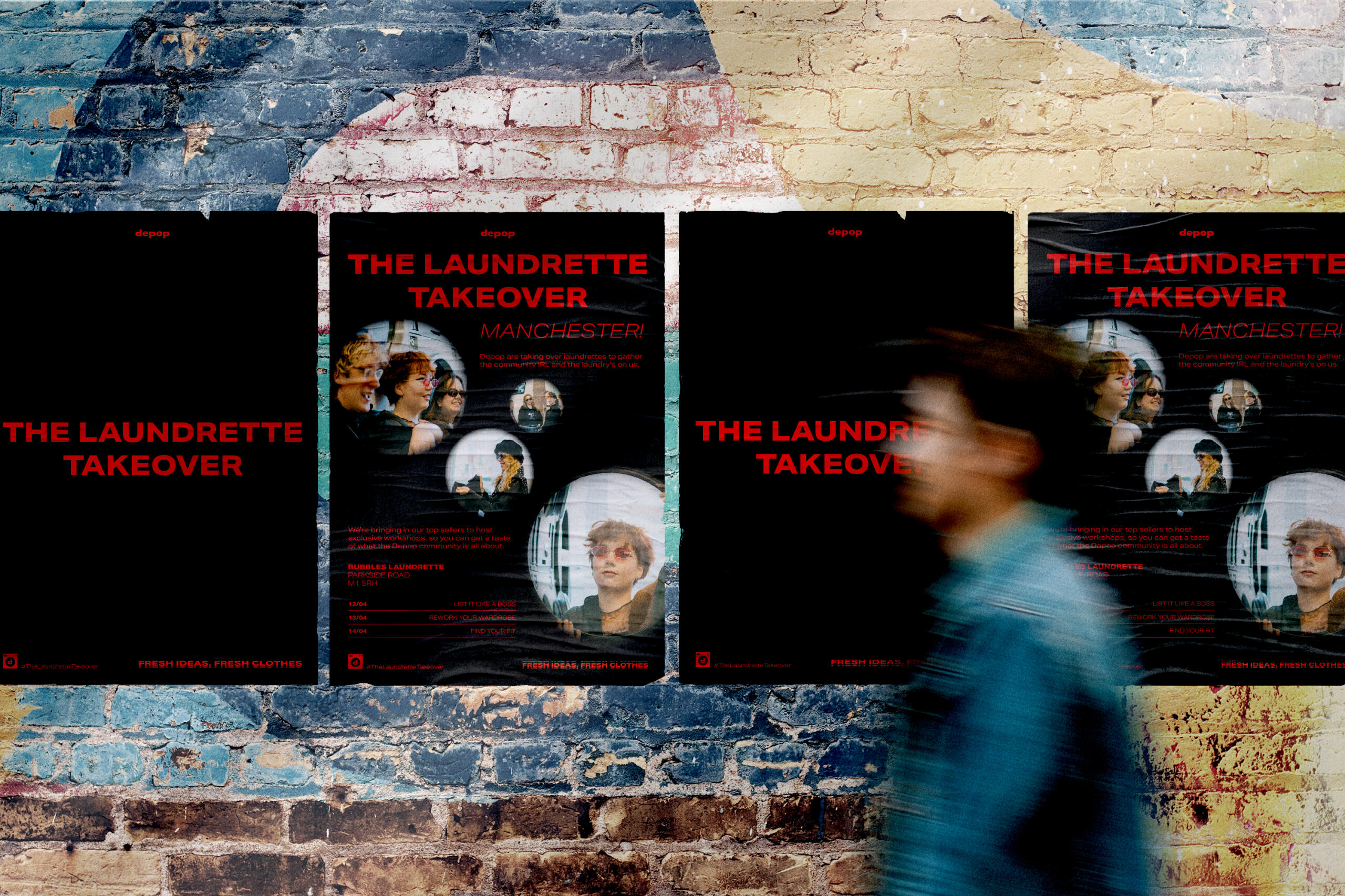
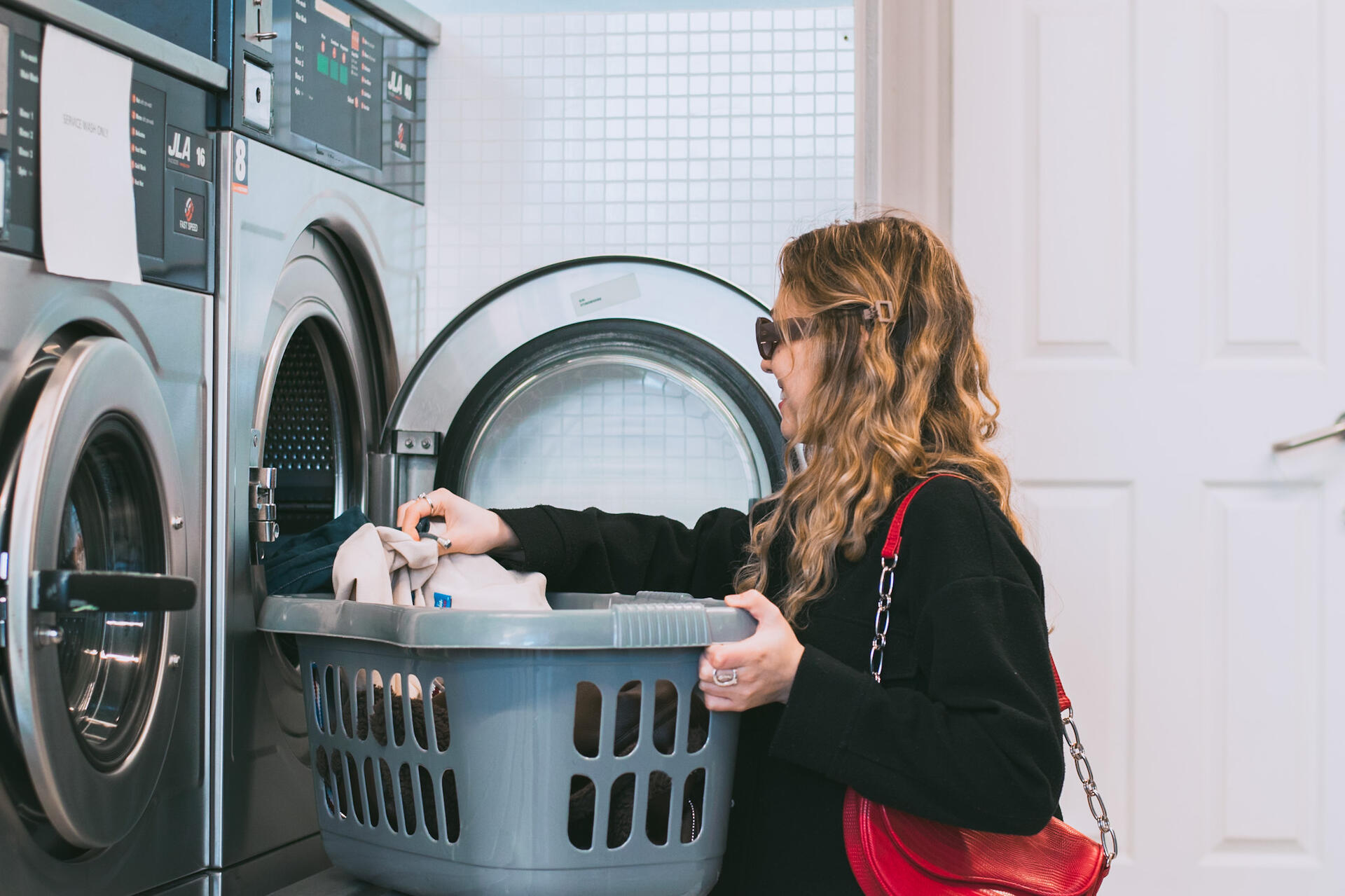
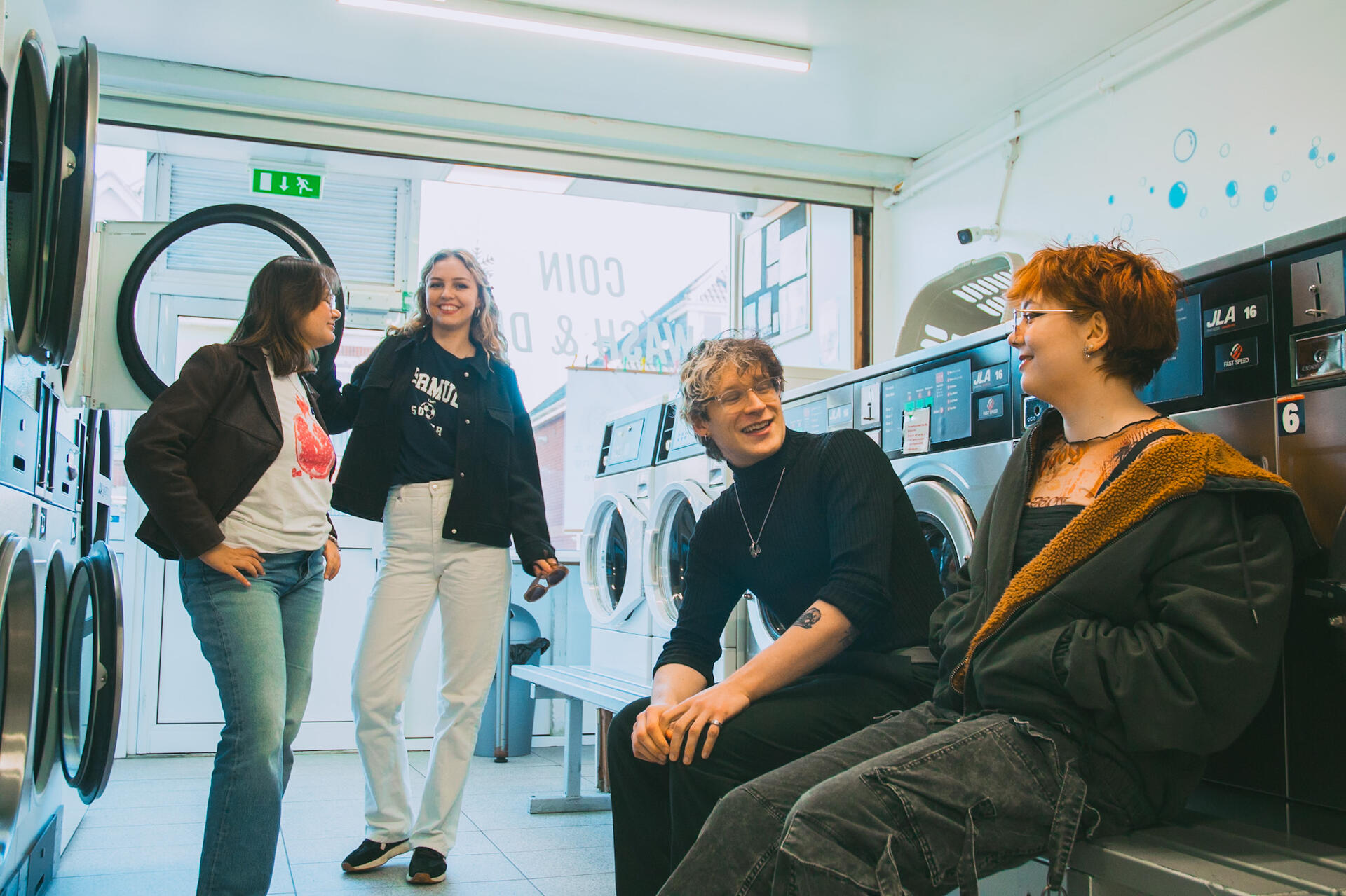
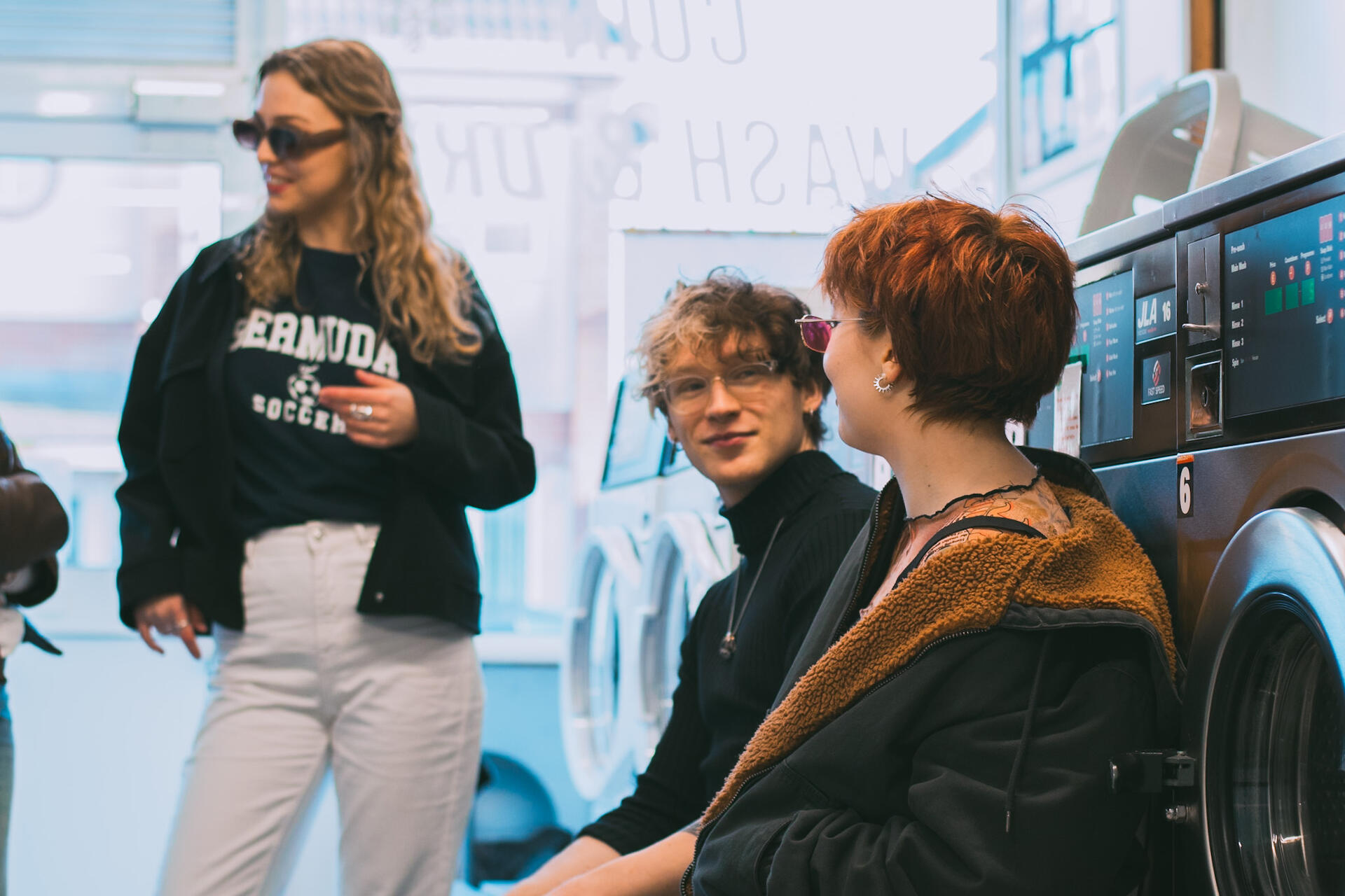
'The Laundrette Takeover' is a PR campaign in response to the Depop D&AD 2025 brief.
I worked in collaboration with another designer, Luc Lockyer, to create 'The Laundrette Takeover'. Depop is a fashion resale platform aimed primarily at Gen-Z. The brief asked us to harness Depop's community to 'make Depop the talk of the town again' amongst crowding competitors. Laundrettes might seem like a strange setting for holding a community event- but that was what we loved about it. The brief asked us to be 'bold and disruptive' and we began to identify reasons and associations that made it make sense.
Development
We worked collaboratively in person to ideate and complete the project by meeting regularly. I really enjoyed working as a team since our skillsets complemented each other.
At the beginning of the project, we created illustrations and used stock imagery to attempt to demonstrate our concept. However, this didn't feel authentic to Depop's brand as they rarely use illustration and the stock imagery also struggled to depict the concept. We decided to conduct our own photoshoot later on. We went through many iterations of finding ways to apply Depop's branding to our concept and created a washing machine logo lockup for the campaign.
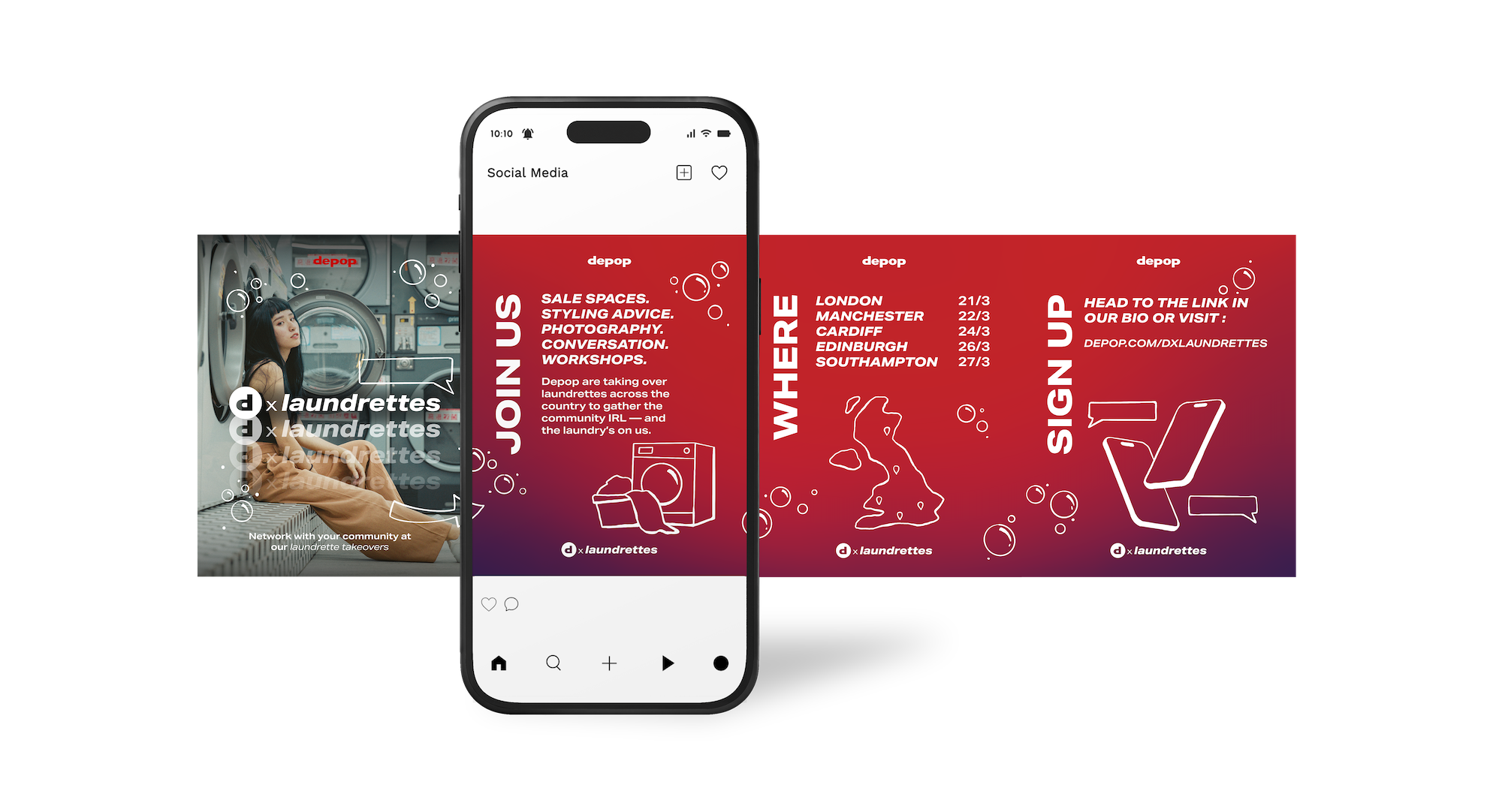
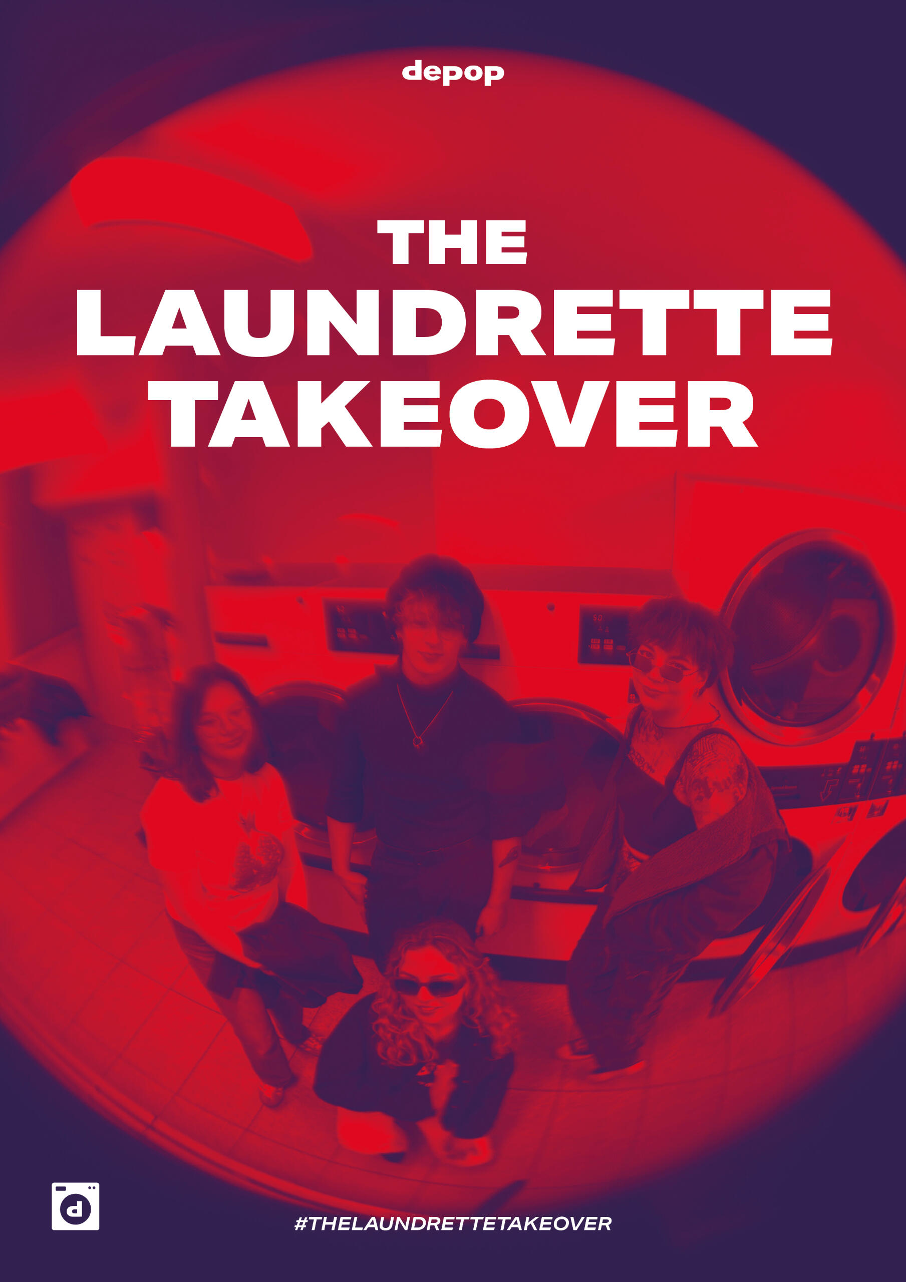
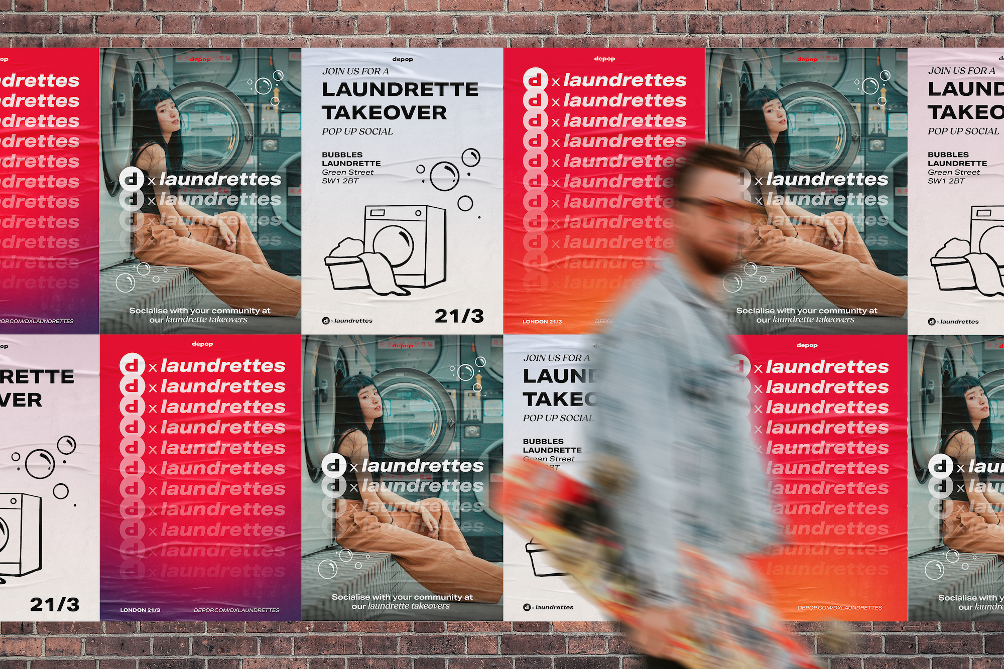
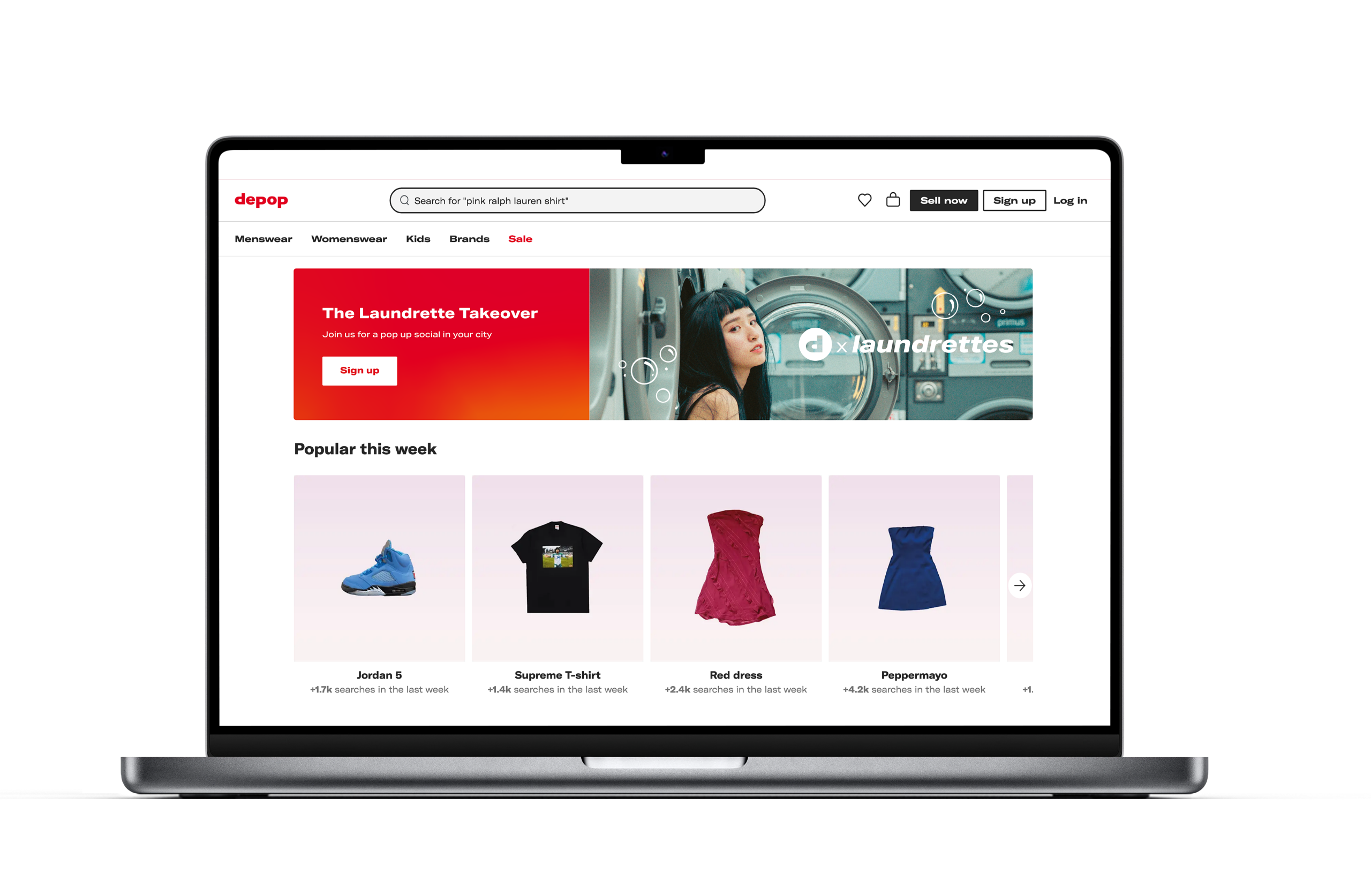
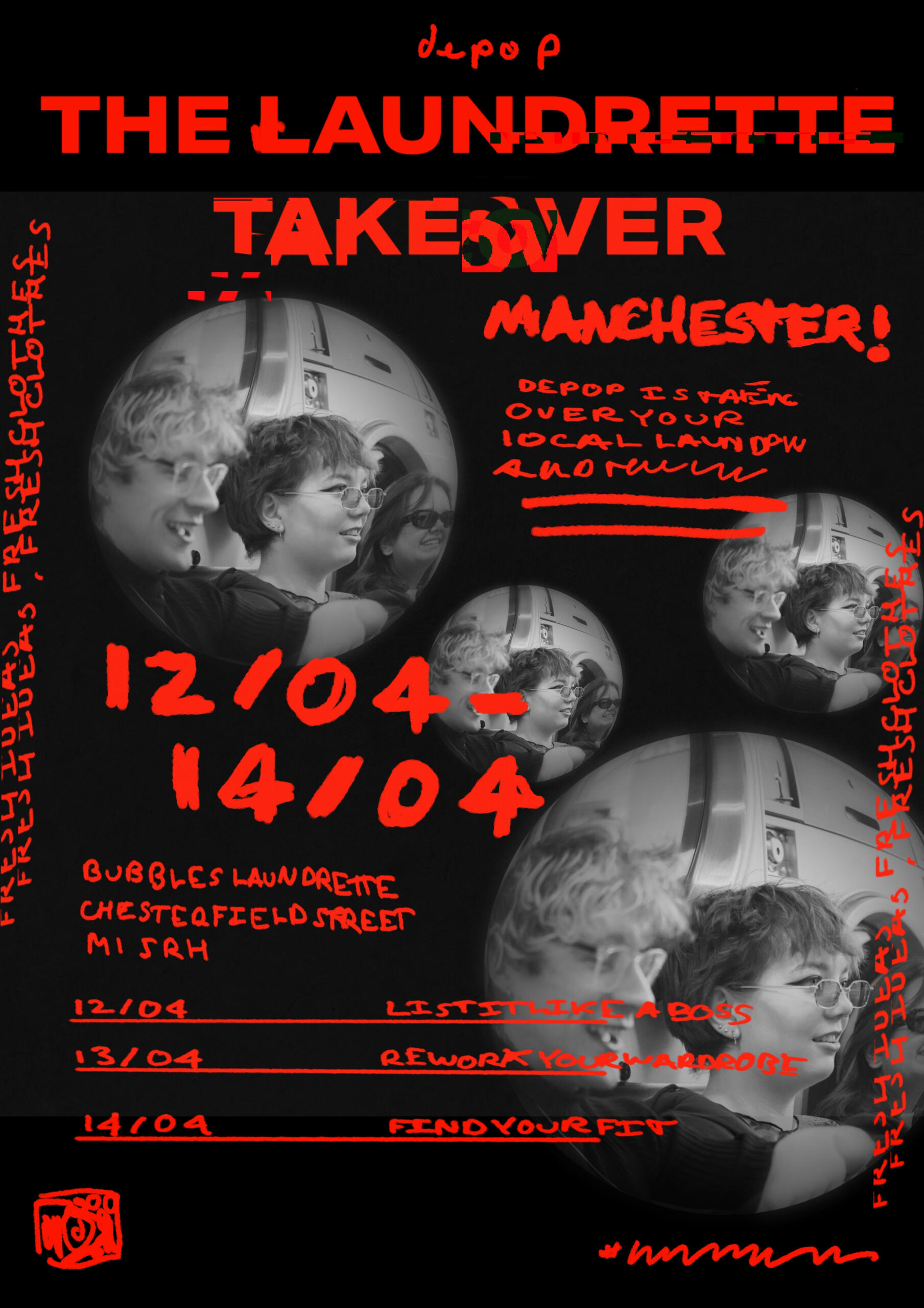
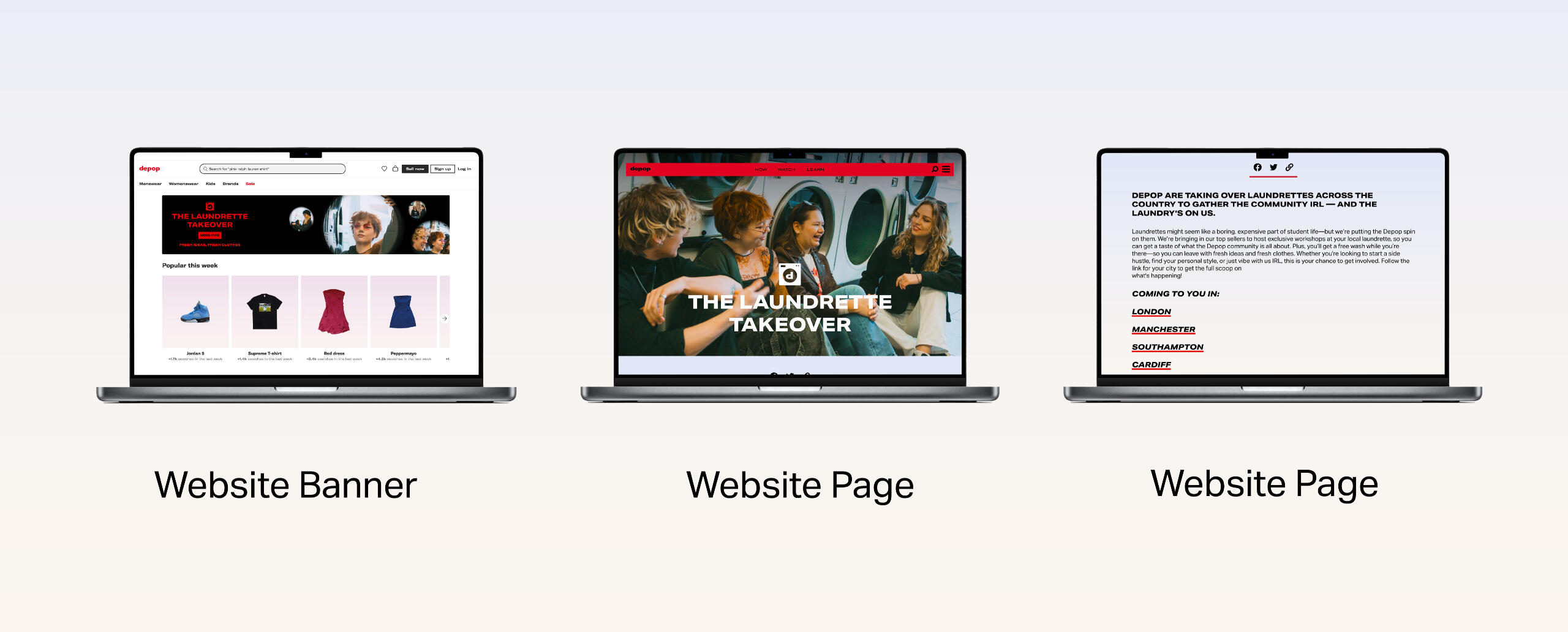
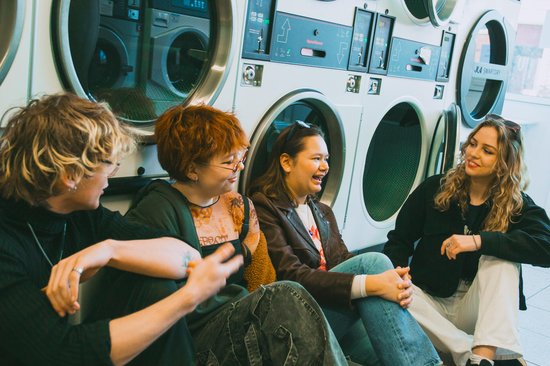
In order to bring our concept to life, we gathered some models and held a photoshoot in our local laundrette. This allowed us to stay in keeping with Depop's largely photography-led branding. The photoshoot helped us to visualise the activities at the event and provided imagery for our assets.

Bringing our Graduation Show branding to life through motion.
I worked in collaboration with Luc Lockyer to bring our graduation show branding to life through motion. We created an ident and show reel sequence using brand assets created by another team member. See the highlights reel below!